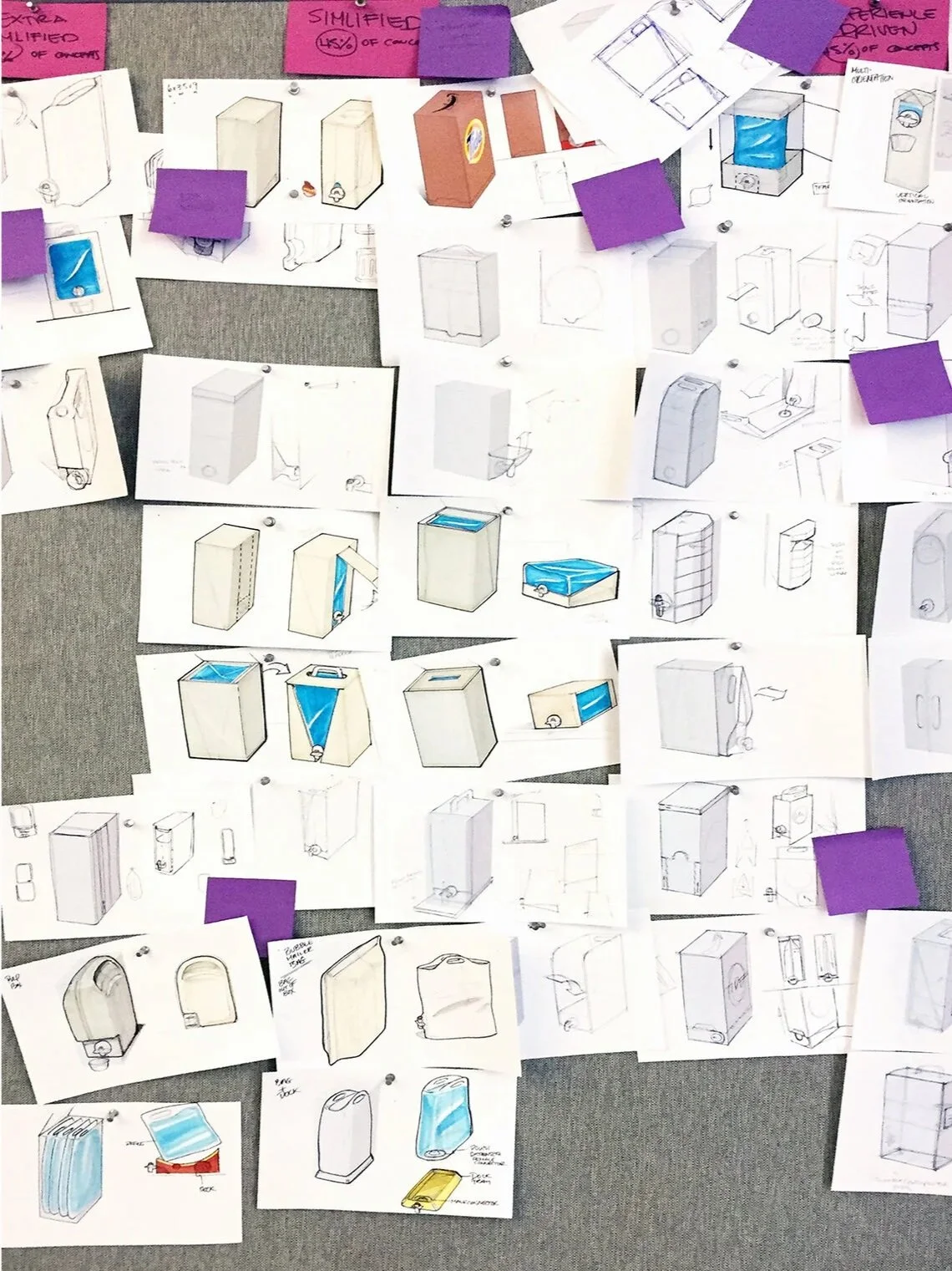
A sustainable packaging brand built on post-consumer recycled materials — brand identity and structural packaging design that proves eco-credentials and premium shelf presence aren't a trade-off.
The sustainable packaging category has a persistent design problem. Brands that commit to recycled or compostable materials tend to signal that commitment through a shared visual vocabulary — kraft brown, hand-drawn type, muted earth tones, abundant white space — that reads as premium to early adopters but fails to cross over to mainstream retail. At specialty retail, this aesthetic has become noise: indistinguishable brands competing on the same visual frequency while communicating nothing distinct.
EcoBox entered the market with a different brief: build a sustainable packaging system that performs at shelf without relying on eco-signaling aesthetics. The structural design had to be engineered around the real material constraints of post-consumer recycled substrates — different caliper, different scoring behavior, different print response — while the brand identity had to stand on its own as design, not apology.
Disciplines
Study
Category analysis across sustainable household and consumer product brands revealed a predictable pattern: eco-positioned packaging consistently underperformed at mainstream retail. Not because consumers rejected sustainability — because the visual language of sustainability had been coded as niche. Muted, quiet, craft- inflected design signaled artisan and local, not mass-market and trusted. The mainstream buyer was being asked to accept a design compromise as proof of environmental commitment.
The insight that drove EcoBox was that the material itself — the texture, the honest imperfection of post-consumer substrate, the visible fiber structure of recycled board — was a visual asset, not a liability. The design system was built to expose and celebrate what the material is, rather than printing over it with lifestyle imagery that pretends it's something else.
Strategy
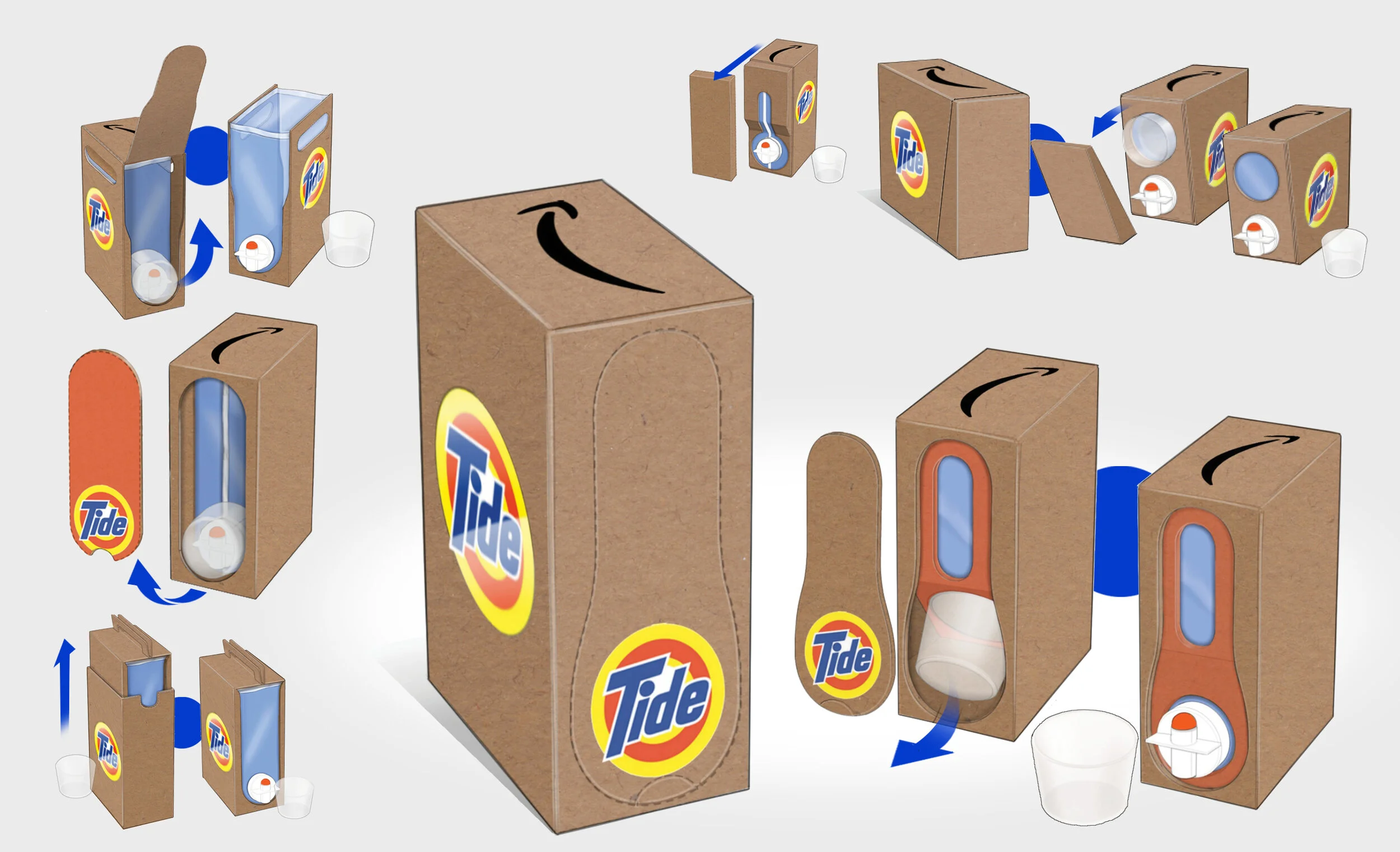
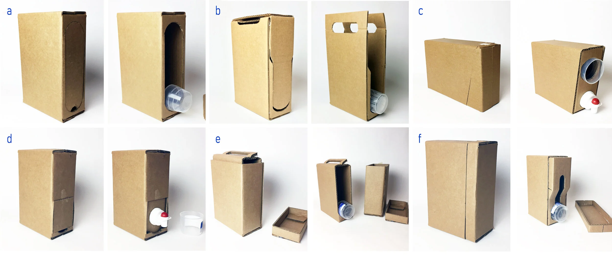
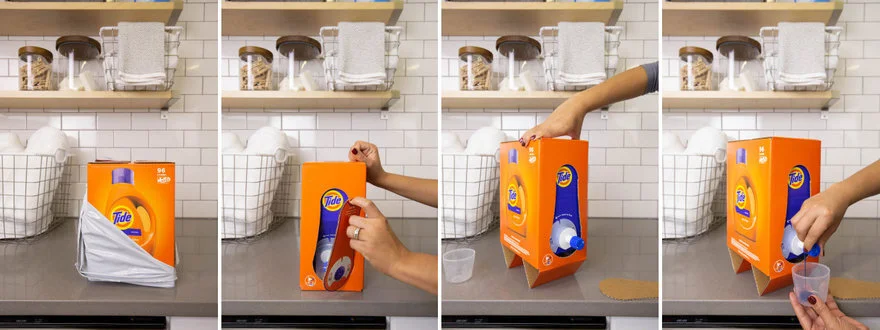
The packaging system was designed material-first. PCR board stock behaves differently than virgin corrugated at every production stage — adjusted die-line geometry accounts for higher caliper variance, scoring specifications were tuned for the reduced fiber consistency of recycled substrate, and color separations were optimized for the ink absorption profile of post-consumer print surfaces. The design had to be specified to what the material can actually do, not what the designer wishes it would.
The brand identity system — high-contrast type, structured grid, deliberate use of the substrate's natural color as a design element — reads as confident and premium while making no attempt to look like virgin-stock packaging. The brand's sustainability story is told through material honesty rather than iconography or claims copy.
Brand identity — early directions
Identity system — refinement
Structural design — material engineering
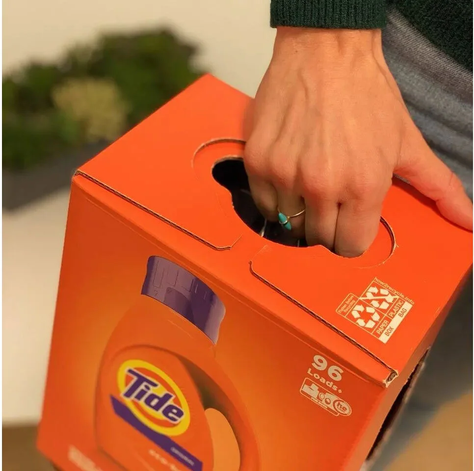
Packaging system — applied brand
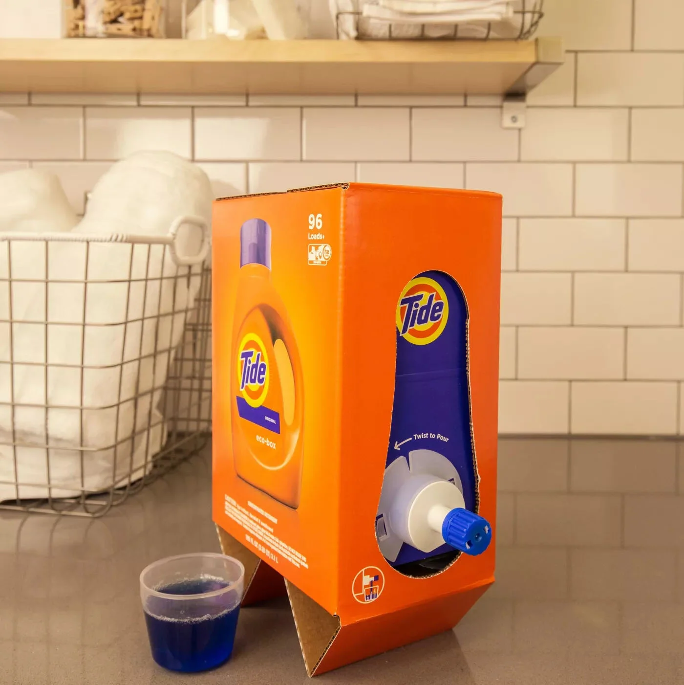
Final system — retail ready
System overview — full packaging lineup
Result
The EcoBox packaging system delivers a sustainable, PCR-material construction with a brand identity that competes on design, not environmental claims alone. The structural engineering accounts for the real material behavior of recycled substrates without sacrificing form or print quality. A brand that doesn't ask customers to accept less in order to buy better.
Outcomes
Material System
Brand System
Details