A collection of kitchenware and housewares designed for Art+Cook — cutting boards, cookware accessories, kitchen tools and hydration, built around a materials-forward design language that holds up at the shelf and in the kitchen.
The mid-tier kitchenware category is one of the most visually cluttered retail environments in specialty retail. Hundreds of SKUs compete on color, price, and impulse packaging — most produced by brands with no coherent design language between products. Art+Cook's brief was to build the opposite: a product family with enough visual and material coherence that the brand was identifiable at 20 feet, and desirable at 2.
The collection spanned cutting boards in TPU and wood composites, cookware accessories, kitchen tools, and a water bottle line — each category requiring its own material and manufacturing logic while contributing to a unified brand aesthetic. The challenge was establishing a design DNA flexible enough to work across radically different product typologies without becoming generic.
Disciplines
Storage & Prep
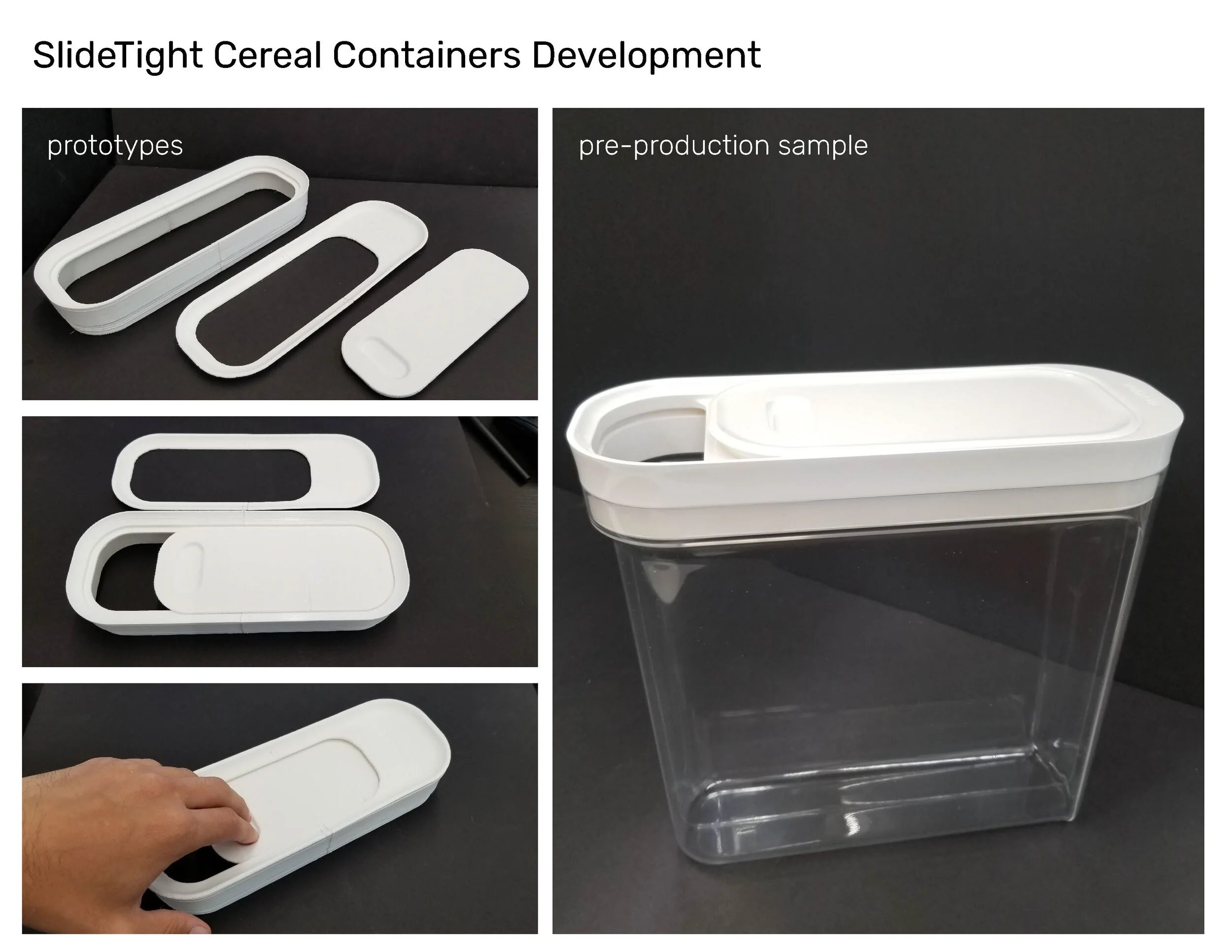
Development ran from early prototypes through a pre-production sample, refining the slide-lock lid mechanism at full scale.
Storage & Prep
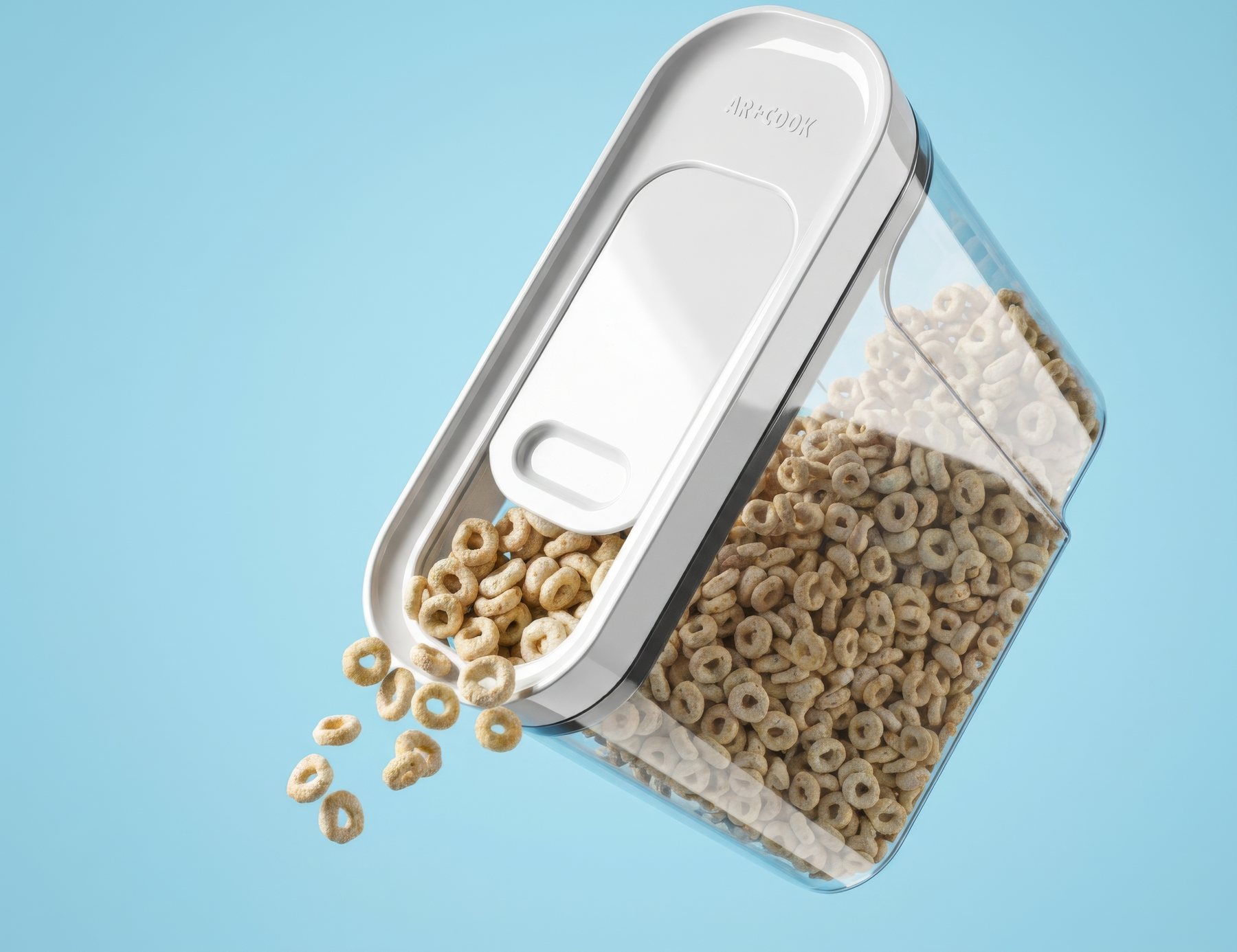
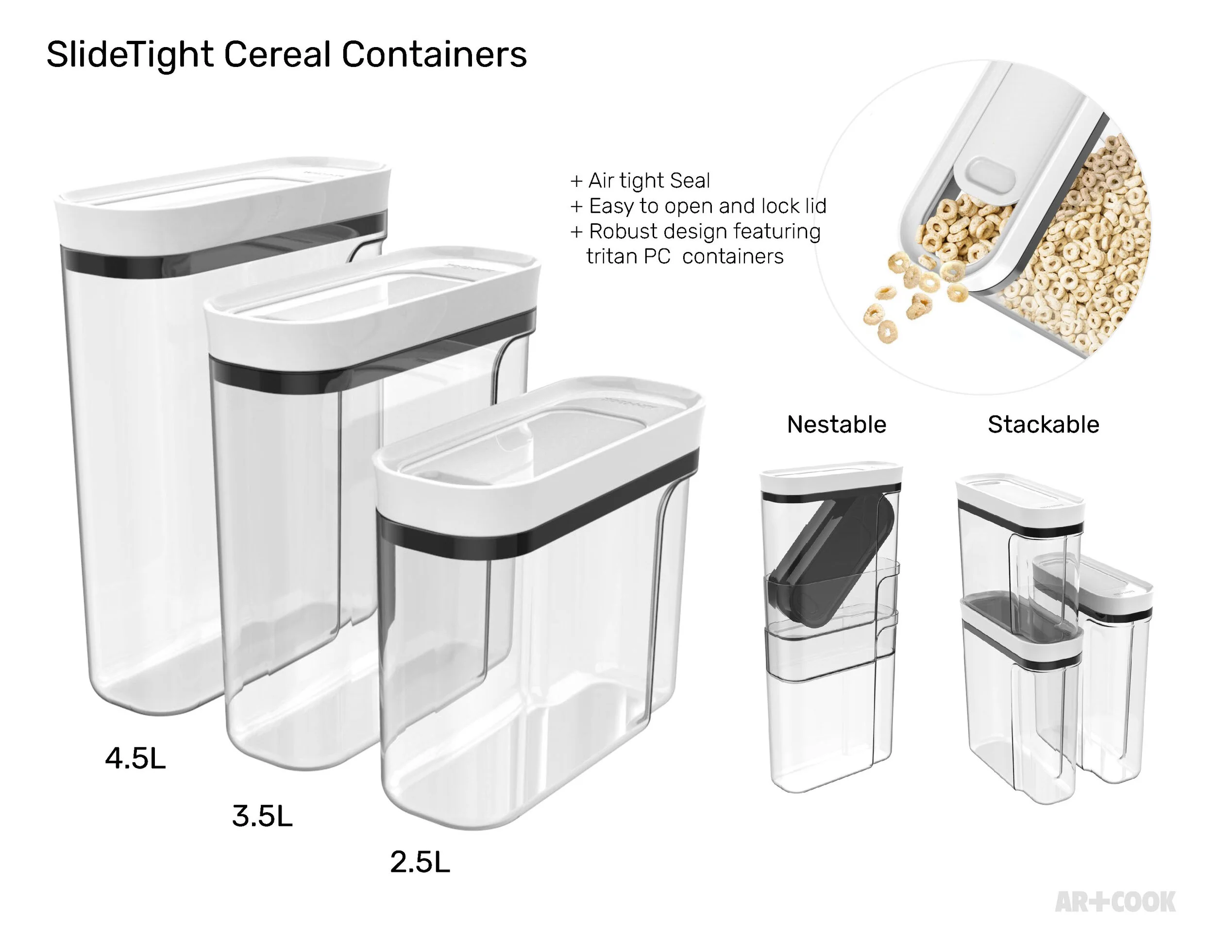
Airtight seal, easy open-and-lock lid, and robust Tritan PC construction across three nestable, stackable sizes — 4.5L, 3.5L, and 2.5L.
Storage & Prep
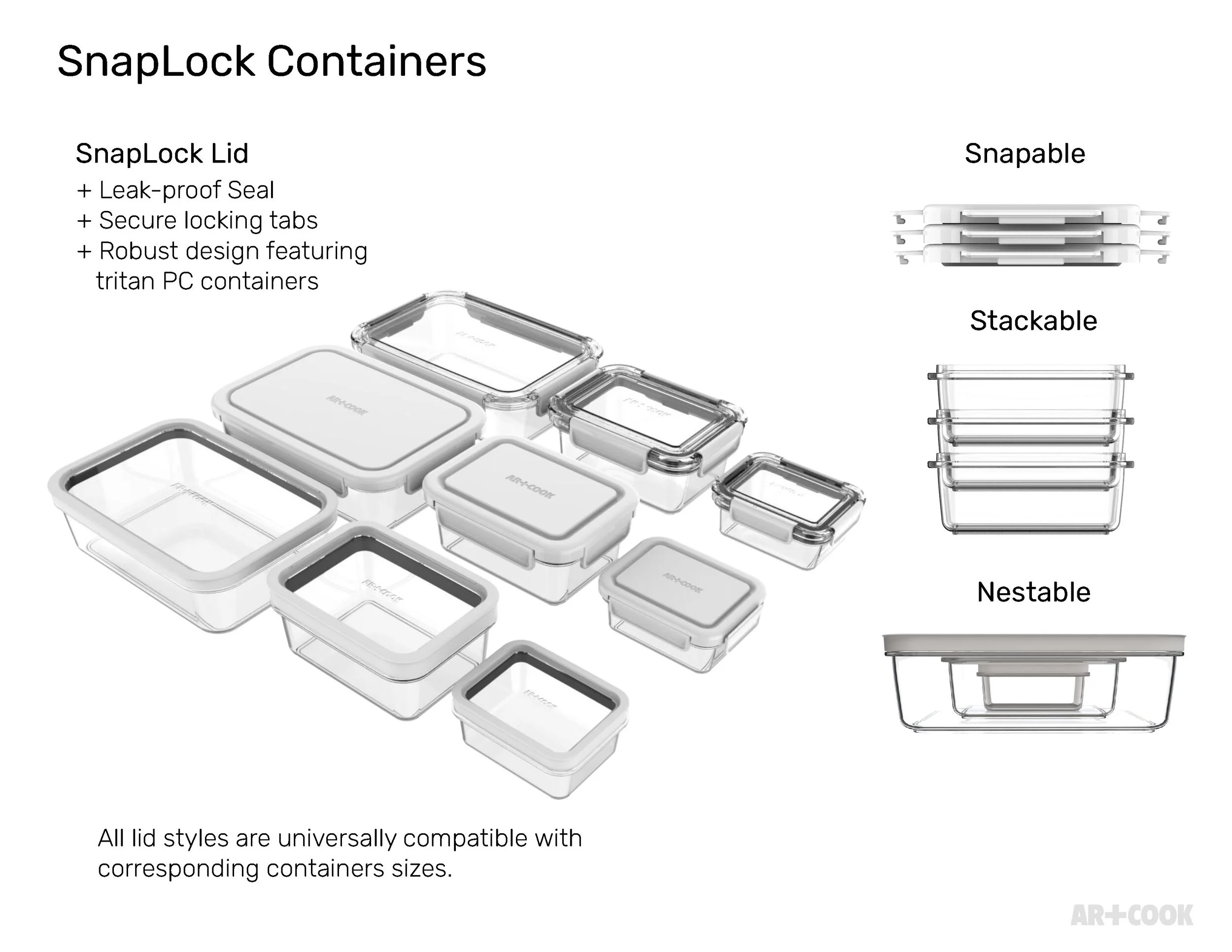
A leak-proof seal and secure locking tabs across a full family of Tritan PC containers — snapable, stackable, and nestable lid styles, all interchangeable by size.
Storage & Prep
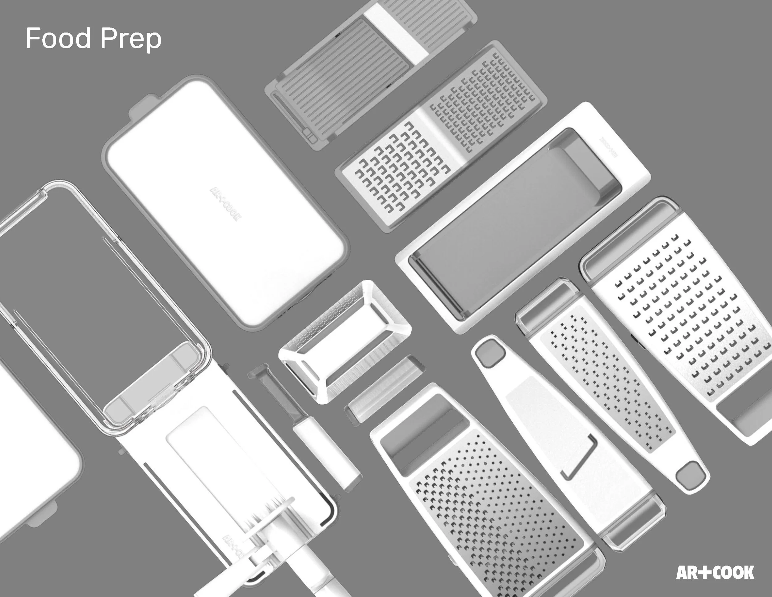
Mandolines, graters, and julienne slicers — a full family of hand-prep tools sharing one construction language before the line split into dedicated collections.
Storage & Prep
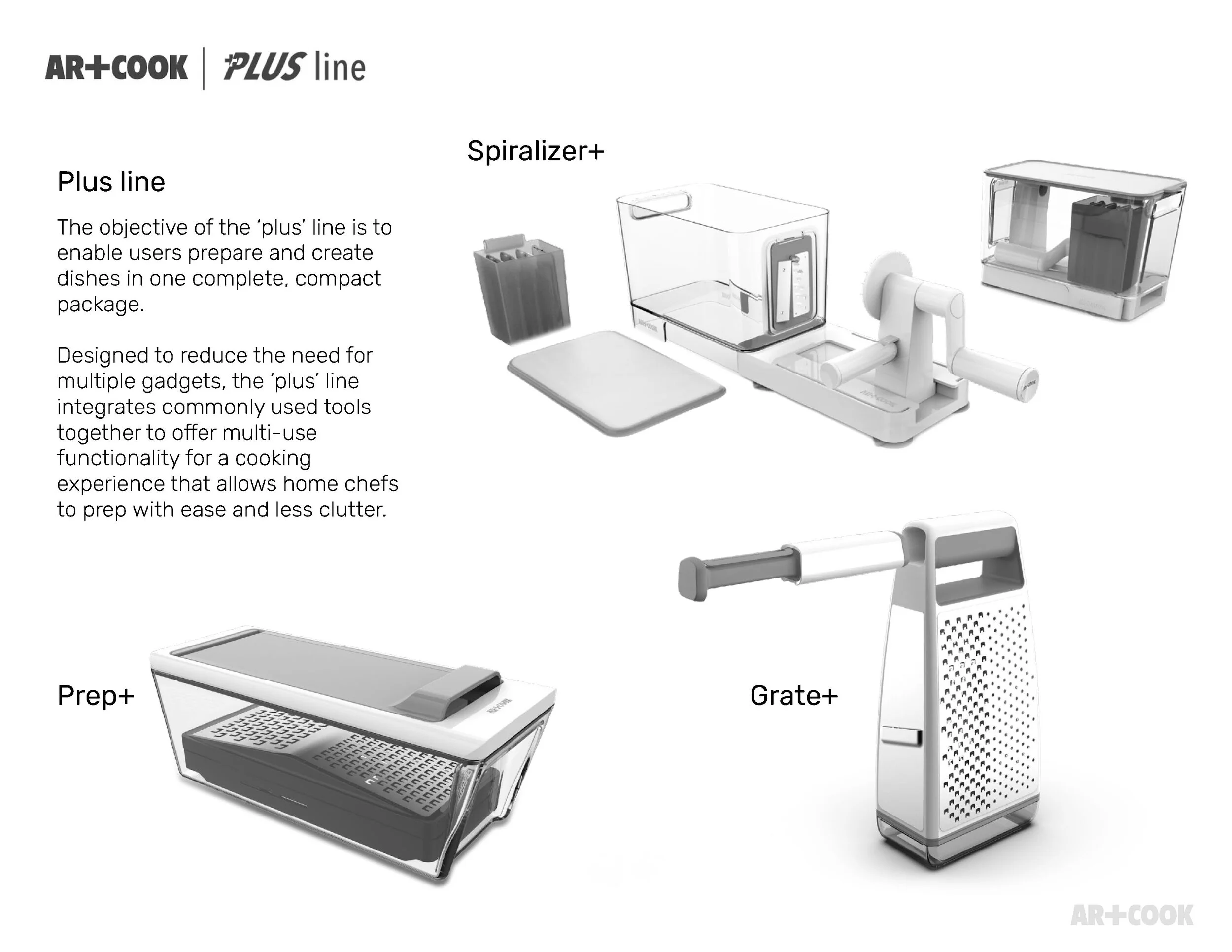
Spiralizer+, Prep+, and Grate+ integrate commonly used tools into one compact package, reducing clutter and the need for multiple single-use gadgets.
Storage & Prep
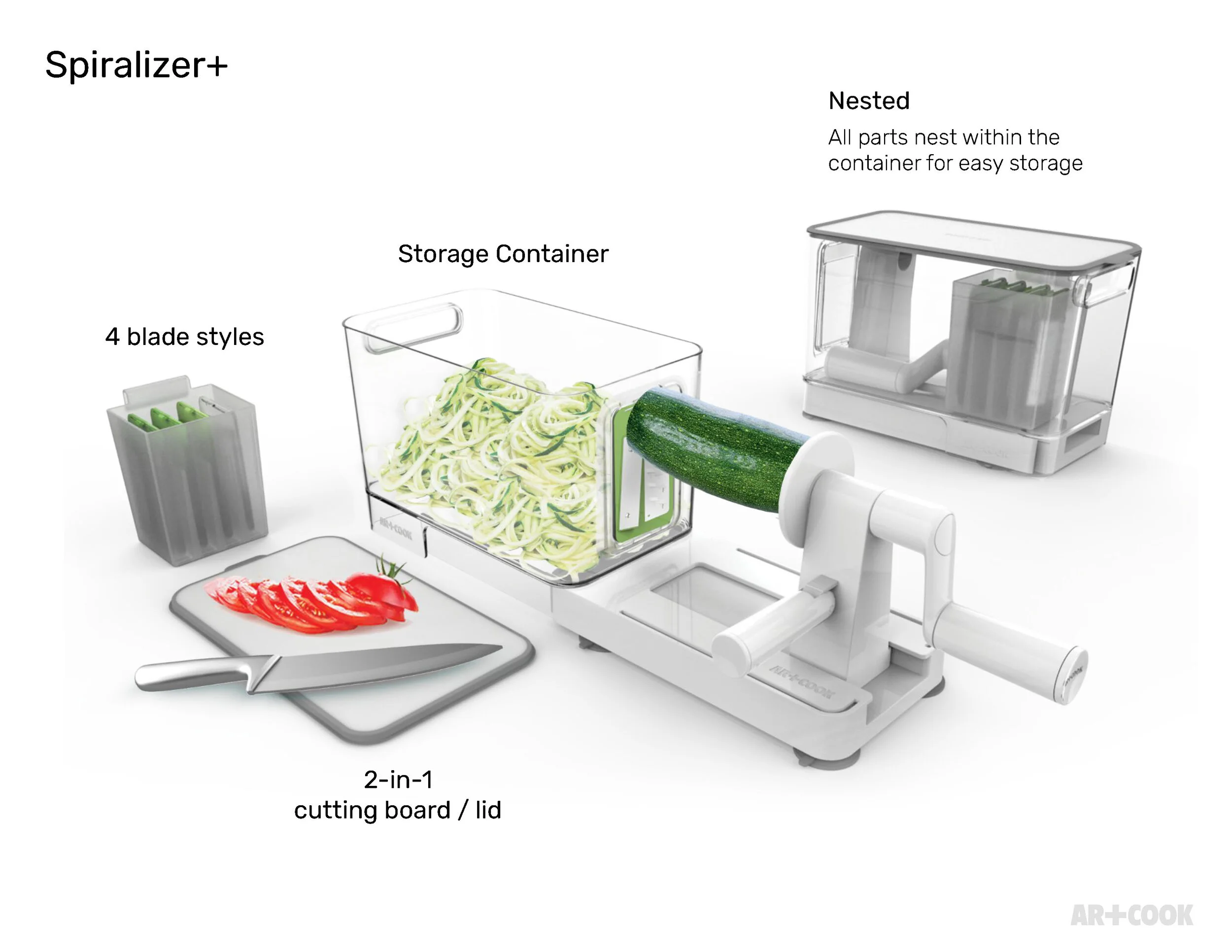
A storage container doubles as the spiralizing base, with four interchangeable blade styles and a 2-in-1 cutting board that serves as the lid.
Storage & Prep
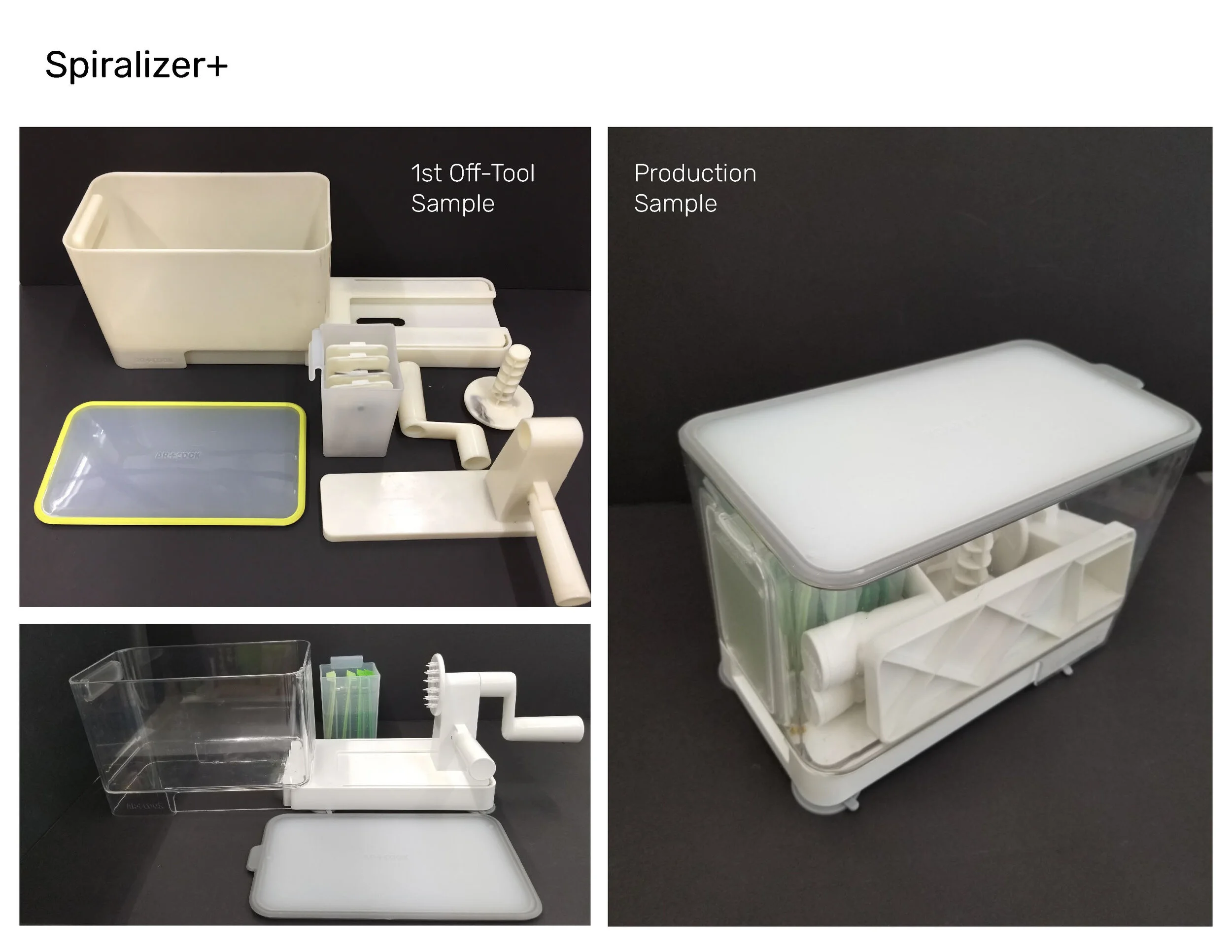
From 1st off-tool sample to production sample — the storage container and internal blade organization held through the full development cycle.
Storage & Prep
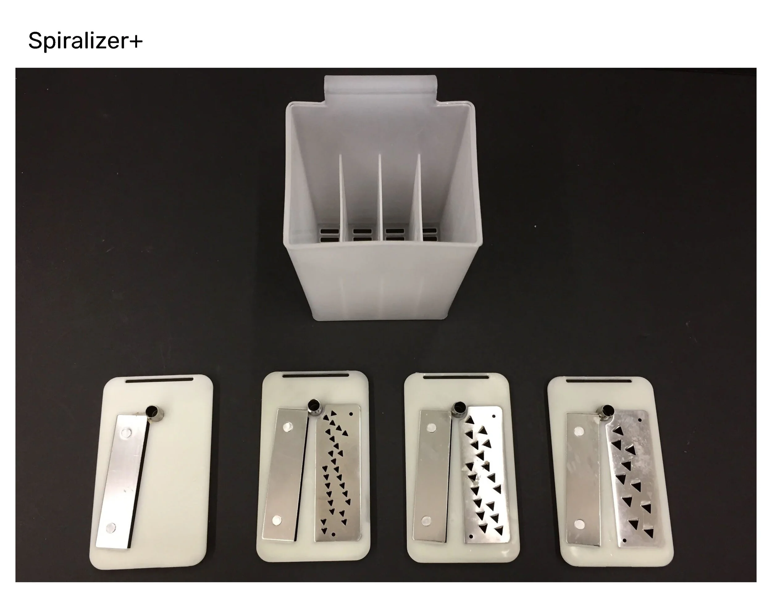
Four blade plates nest inside the storage base itself, so every cut style stays contained in the one unit rather than scattered across the drawer.
Storage & Prep
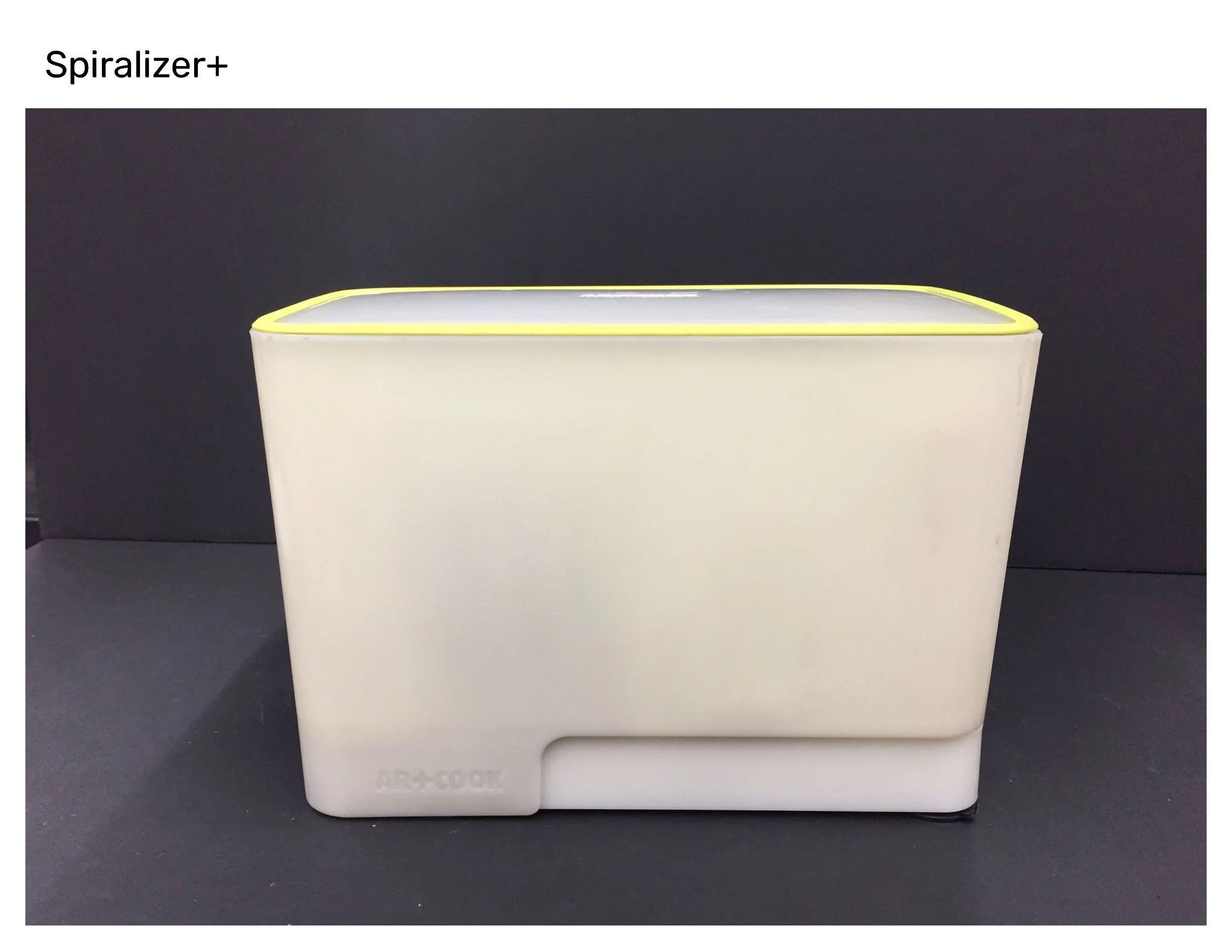
The finished unit, closed — a self-contained countertop footprint with every component stored inside a single molded shell.
Storage & Prep
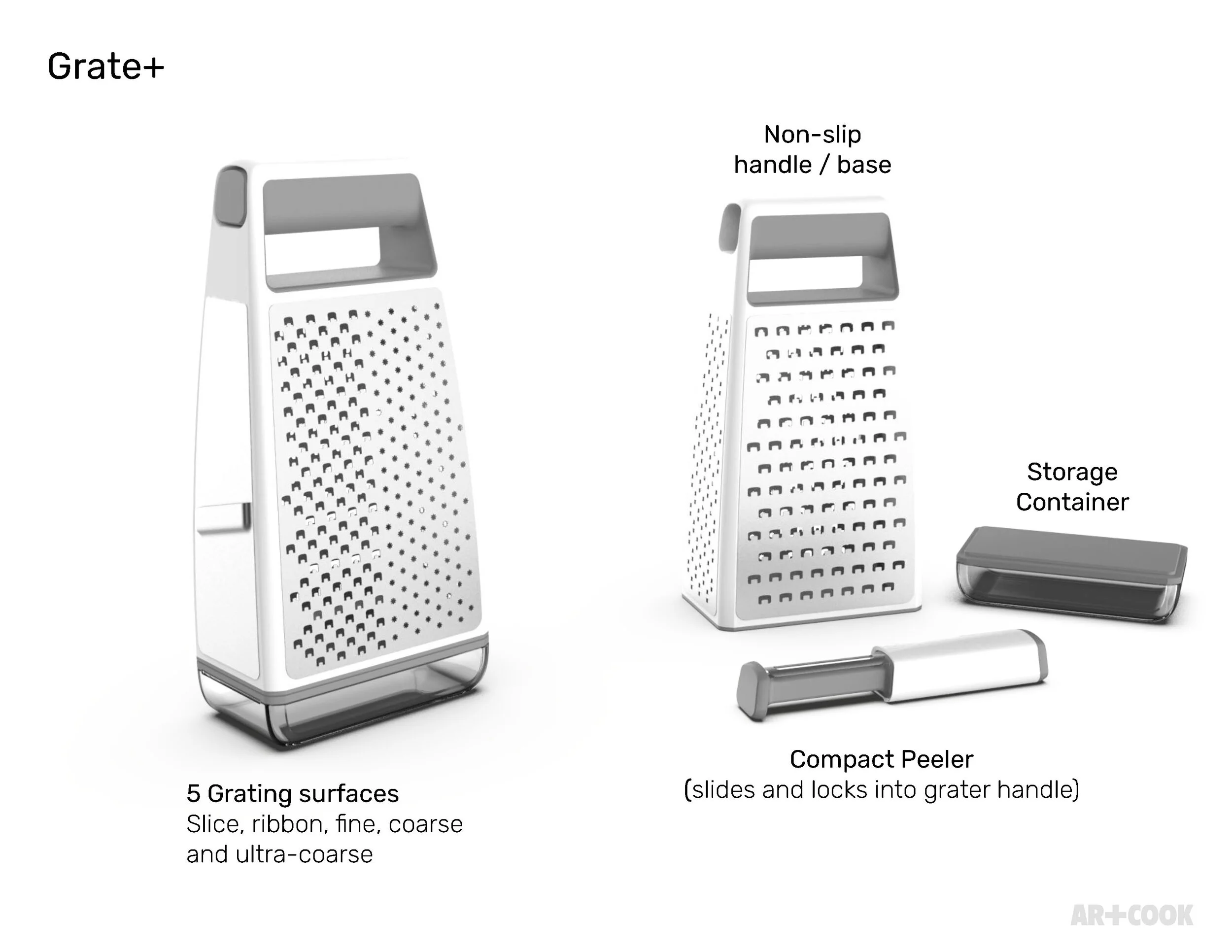
Five grating surfaces — slice, ribbon, fine, coarse, and ultra-coarse — plus a non-slip handle, a compact peeler that locks into the grip, and a built-in storage container.
Storage & Prep
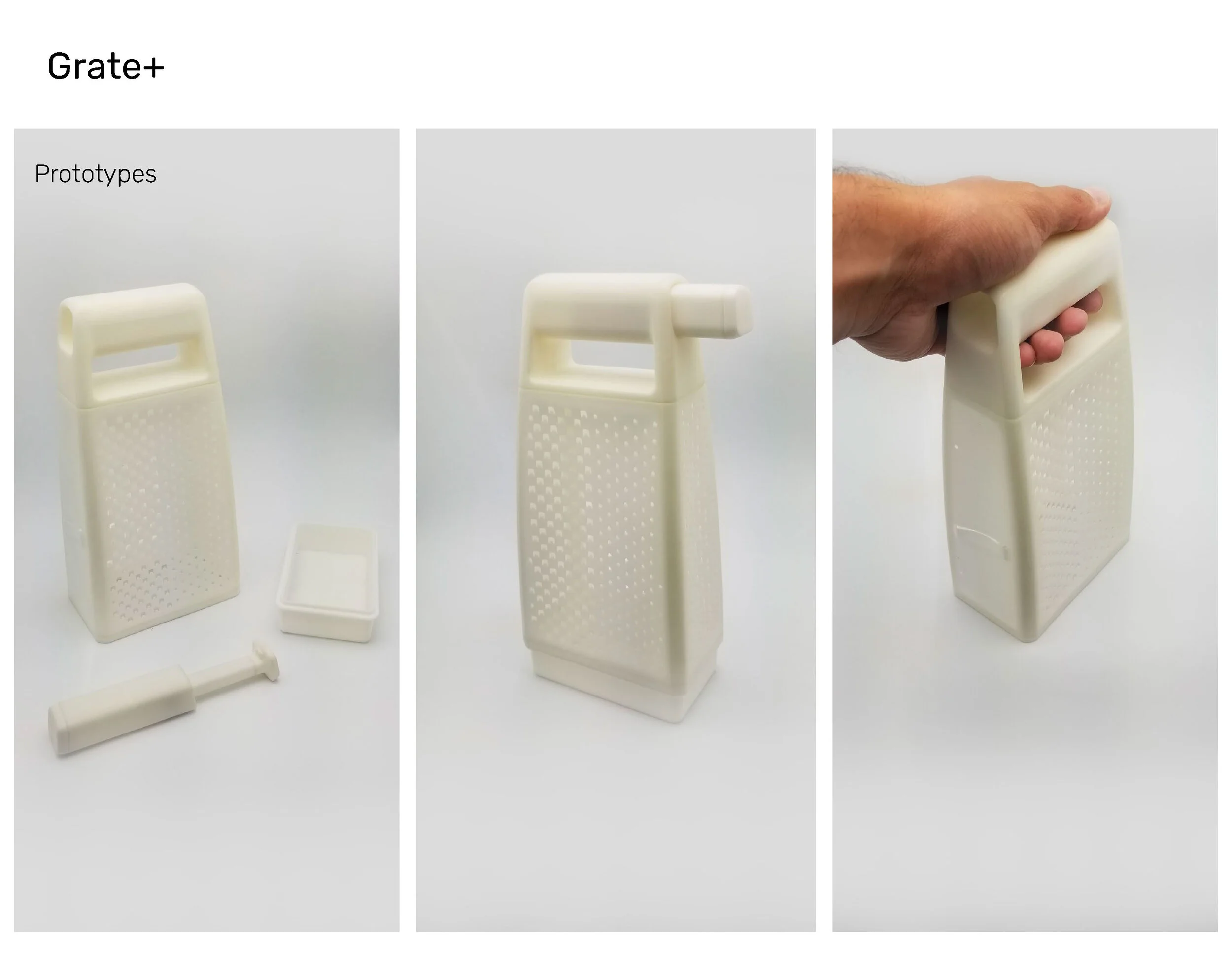
Physical prototypes tested the handle's grip and balance in hand before the grating pattern and base storage tray were finalized.
Storage & Prep
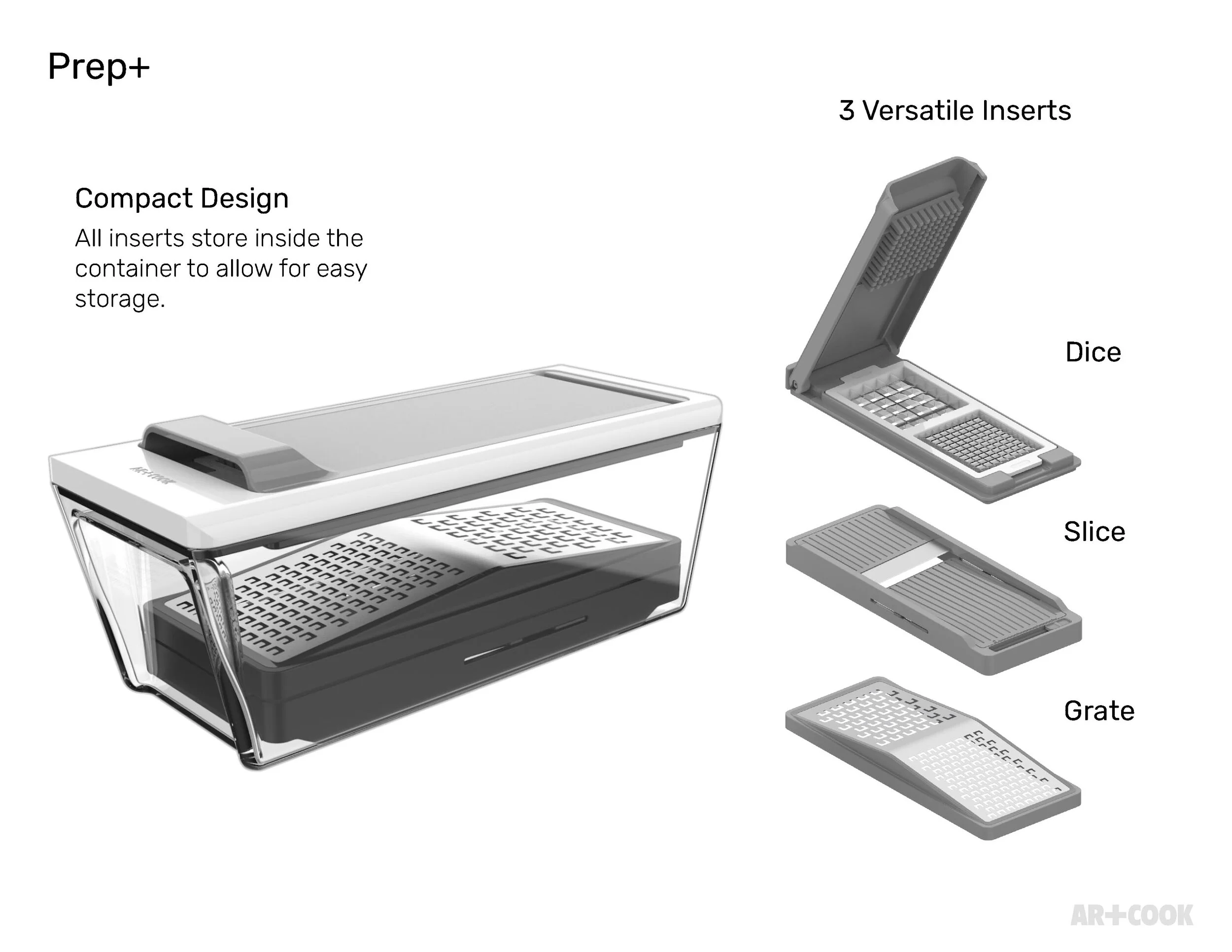
Three versatile inserts — dice, slice, and grate — all store inside the container itself, so the compact design never leaves loose parts to misplace.
Storage & Prep
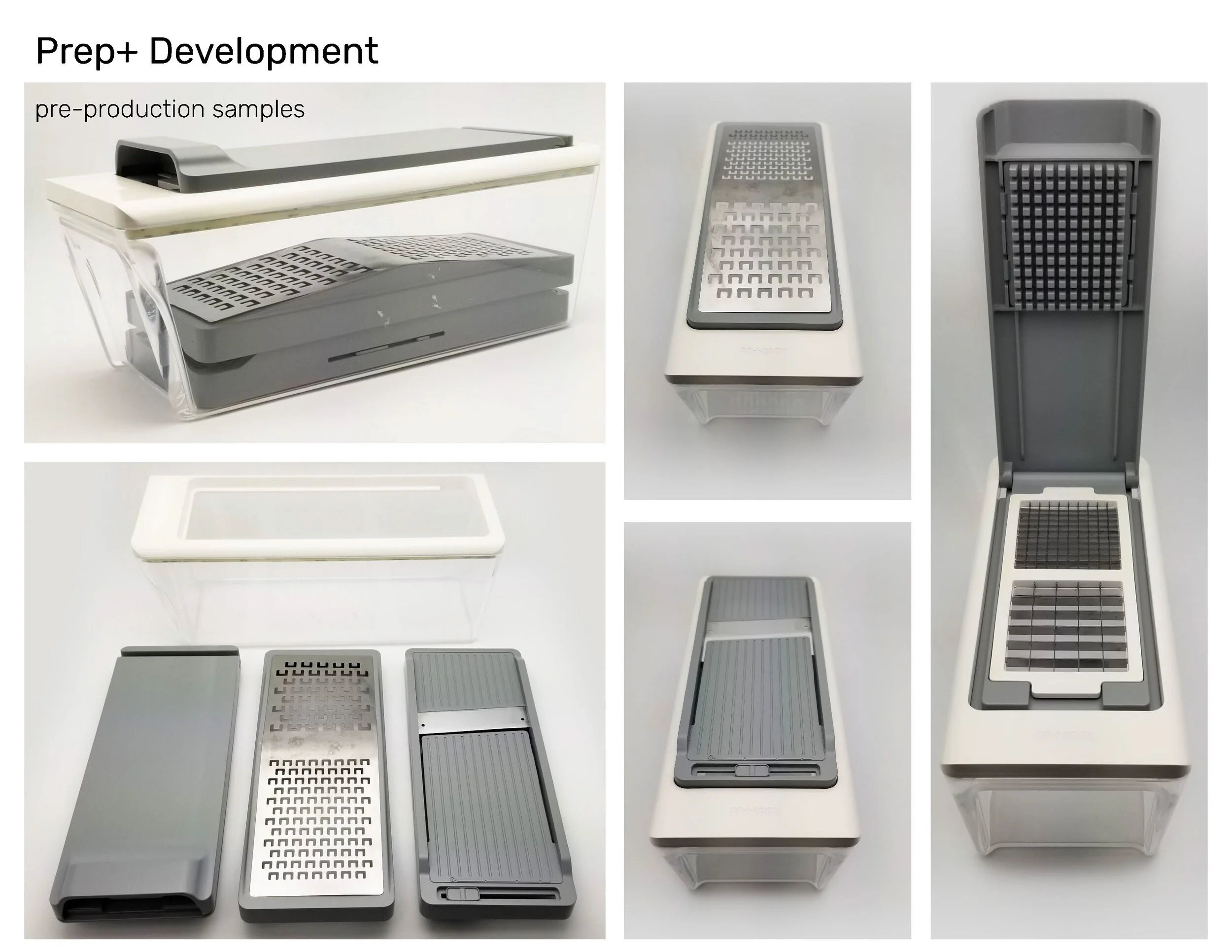
Pre-production samples confirmed the insert-to-container fit and the container's own two-tier storage layout ahead of tooling.
Storage & Prep
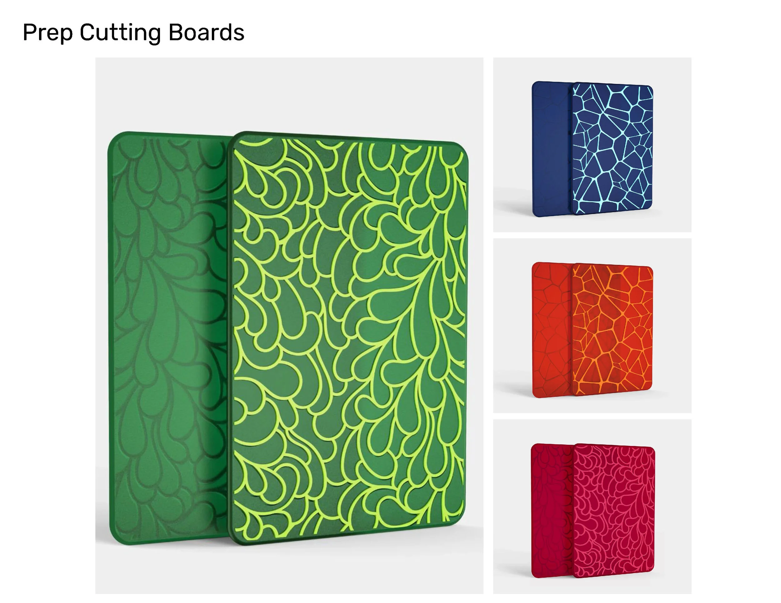
A relief-textured pattern system in five colorways — the same surface language explored on the water bottle line, carried onto cutting boards.
Storage & Prep
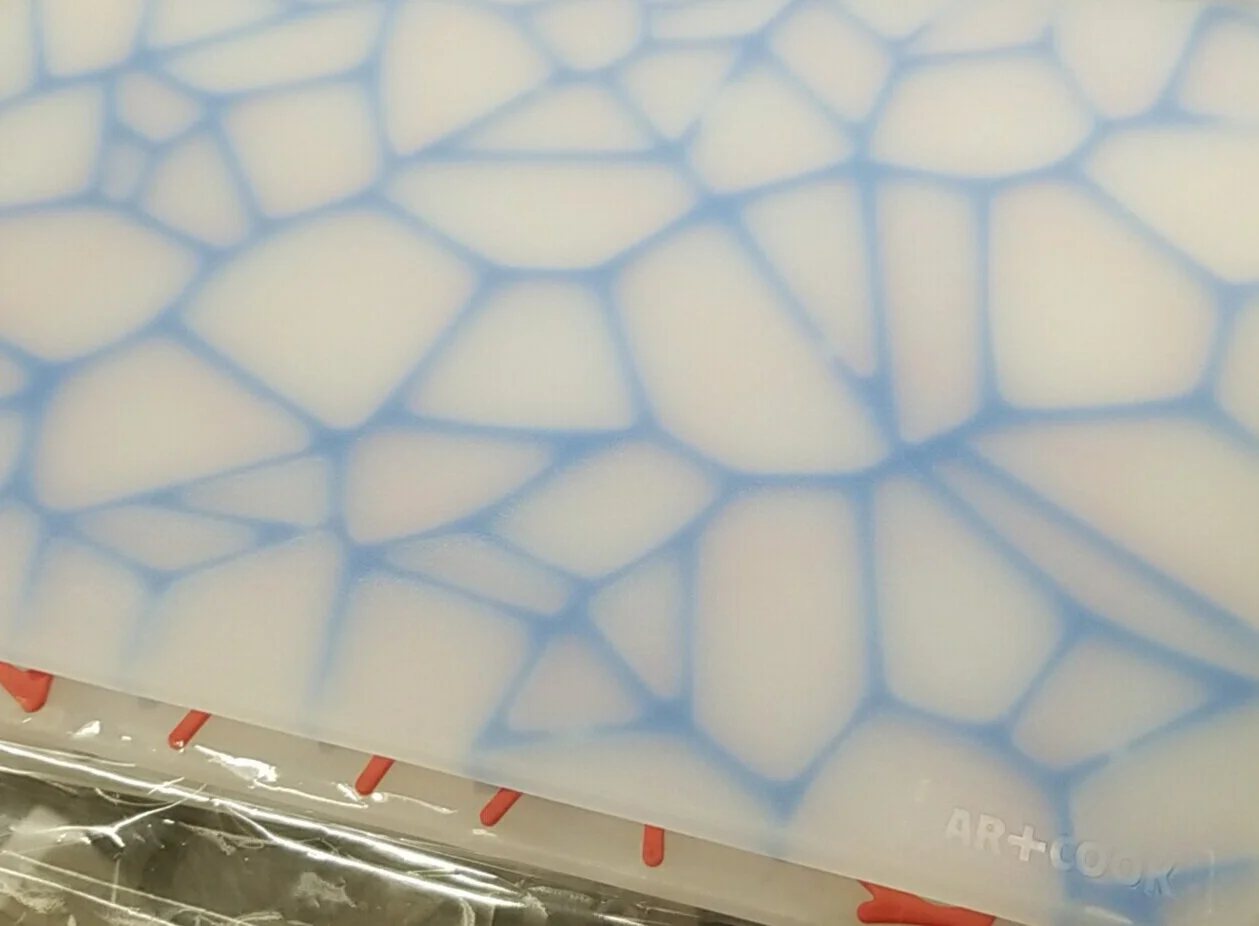
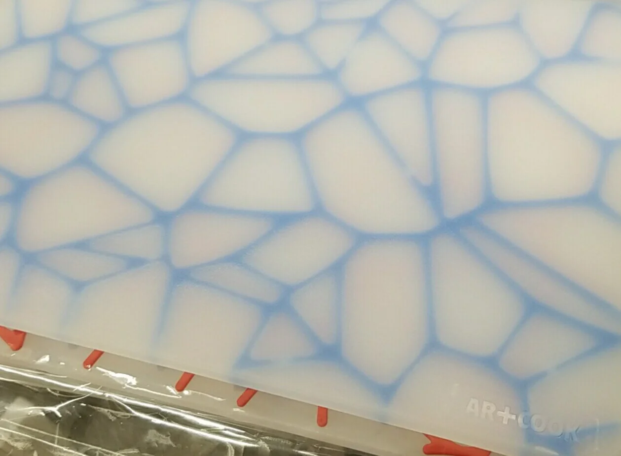
Macro detail of the production TPU itself — the blue vein pattern and the surface's actual hand, not a render standing in for it.
Study
The kitchenware aisle had settled into sameness. Molded plastic in a handful of safe colors, forms that differed only in outline, and surfaces that gave the hand nothing to read. With little separating one range from the next, products were left competing on price and shelf presence alone.
The response was to design for touch and for use. Surfaces carry deliberate texture — relief patterns and material contrast that register in the hand before they register on the shelf — and pieces are built to earn their keep by doing more than one job. Together those two ideas gave the range a reason to exist beyond another set of matching handles.
Hydration
The design strategy was built on a materials hierarchy rather than an aesthetic trend. TPU — flexible, antimicrobial, dishwasher-safe — was established as the brand's primary surface material across cutting boards and kitchen tools. Its translucency became a visual signature: color-dyed TPU reads as both functional and premium at a price point where most competitors use solid polyethylene.
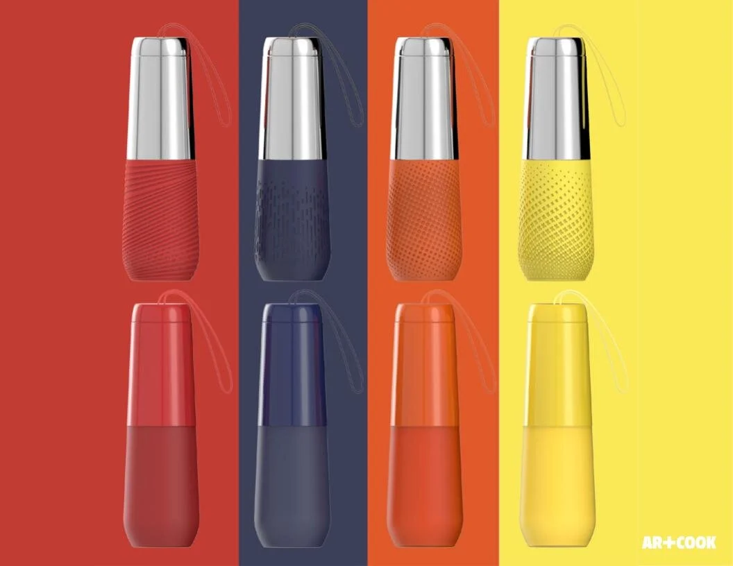
Form language was developed around a consistent radius grammar — the same corner geometry and edge profile appearing across all product categories regardless of material. The water bottle line extended the range into hydration with a body proportion and finish that read as Art+Cook without requiring a logo to identify it.
Strategy
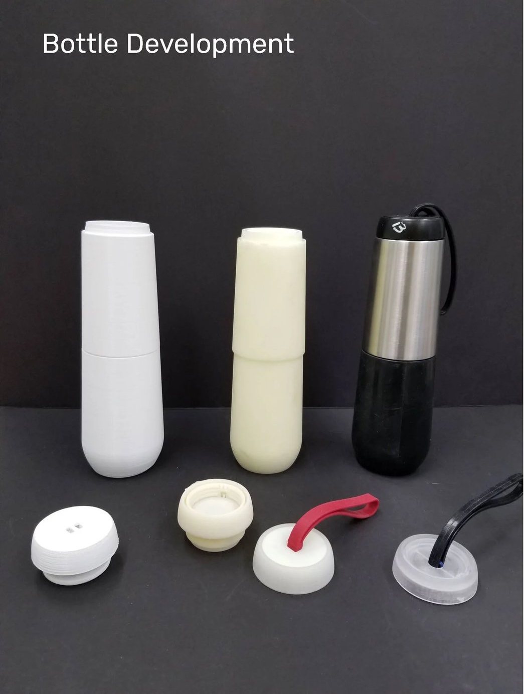
Rapid prototypes and a pre-production sample validated wall thickness, cap engagement, and grip geometry before a single production tool was cut.
Strategy
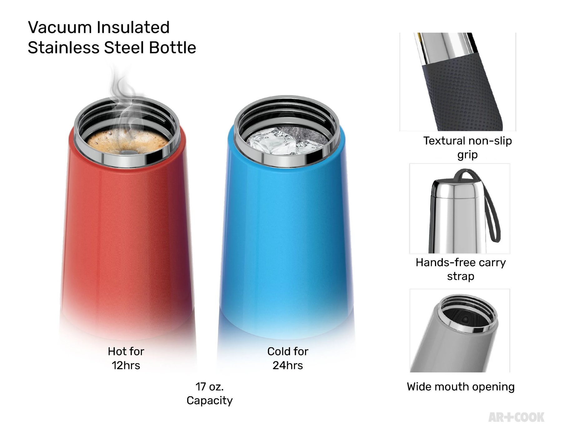
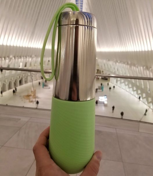
17oz capacity, 12-hour hot and 24-hour cold retention, a textural non-slip grip, and a wide-mouth opening — performance the finish had to be worthy of.
Strategy
In hand, in transit, away from the retail environment entirely — the same body proportion and finish still carry the brand without a logo doing the work.
Cooking
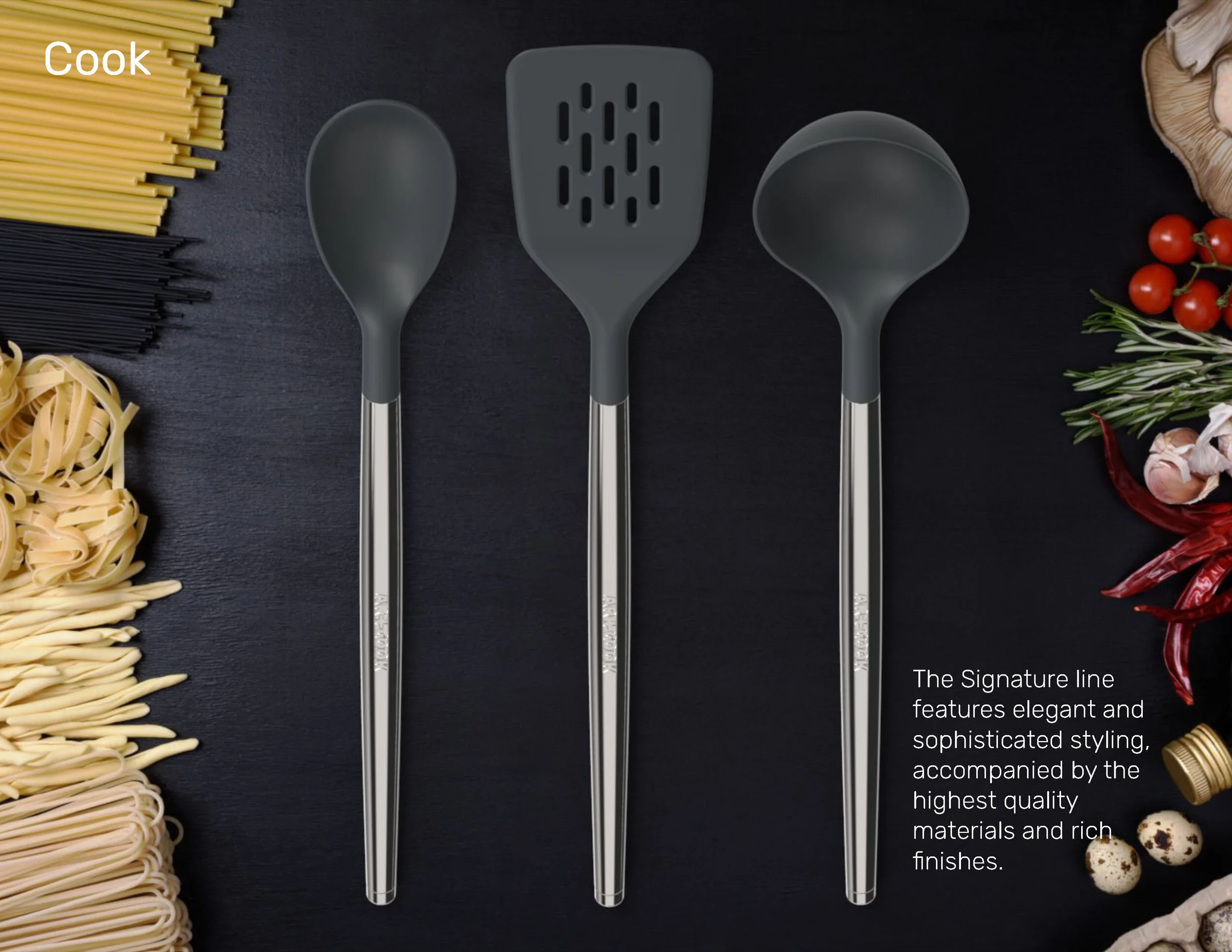
Elegant, sophisticated styling, paired with high-quality materials and rich finishes — the line's design language in daily use.
Cooking
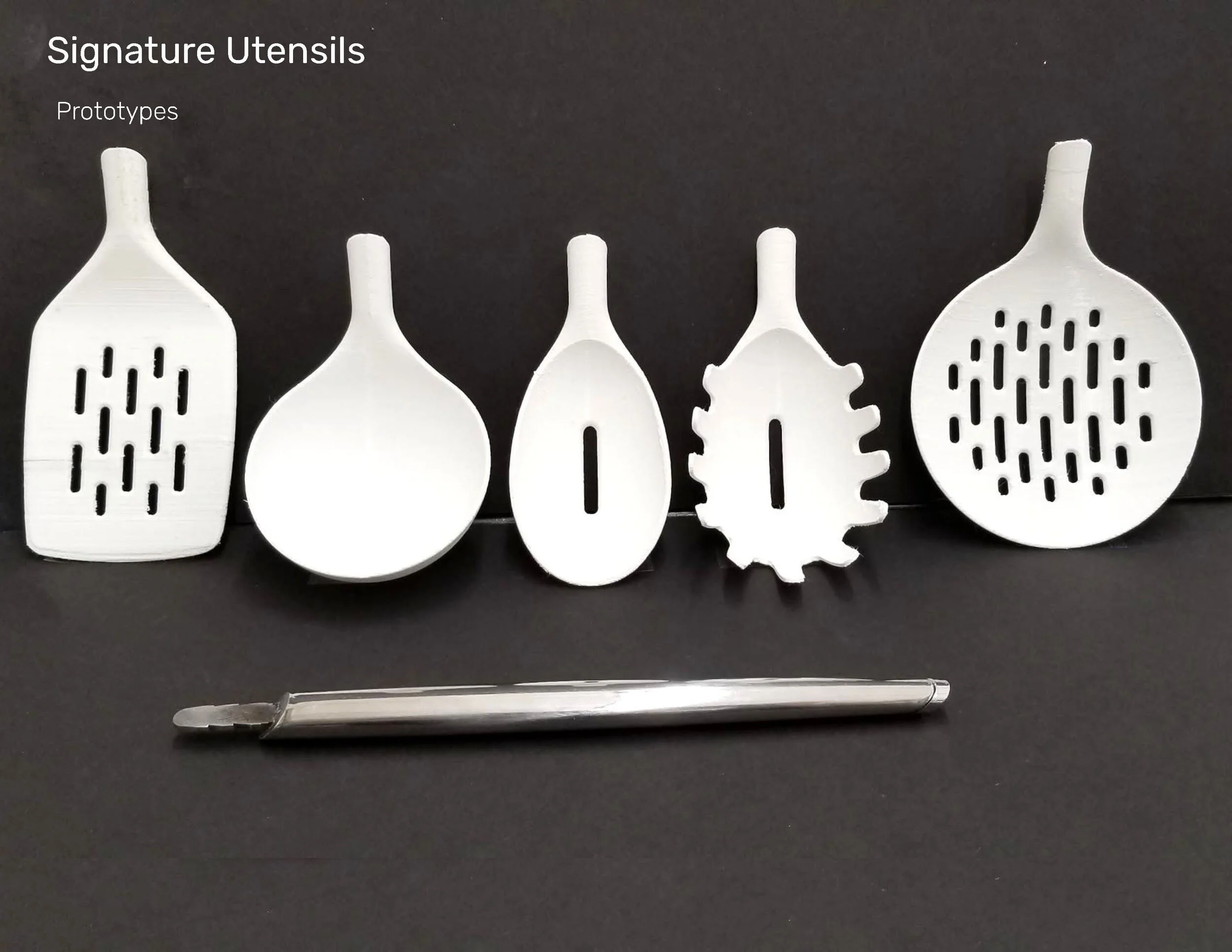
Early prototypes — five head profiles and a steel handle blank — tested by hand before the eight-piece lineup was finalized.
Cooking
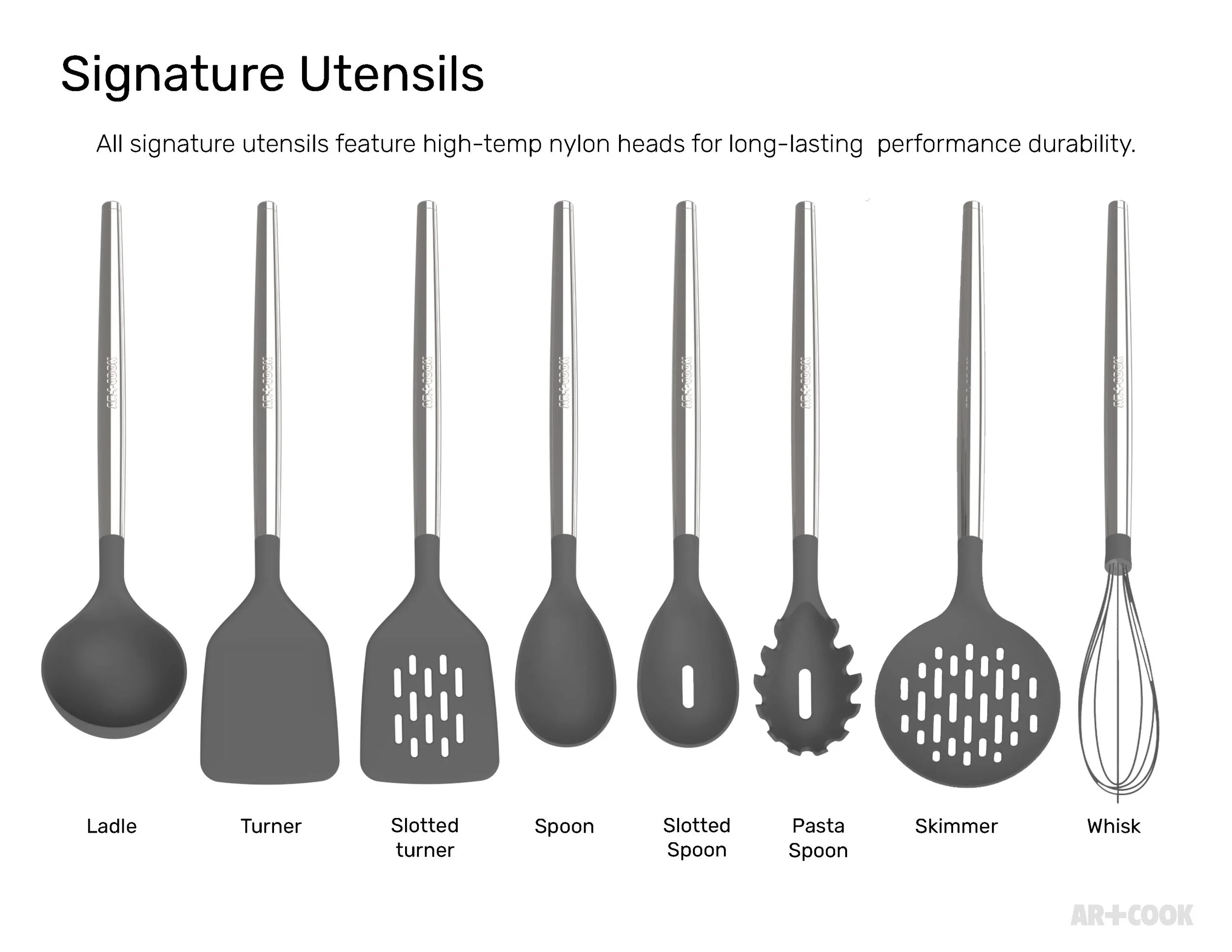
Ladle, turner, slotted turner, spoon, slotted spoon, pasta spoon, skimmer, and whisk — eight tools on one handle language, with high-temp nylon heads for long-lasting durability.
Cooking
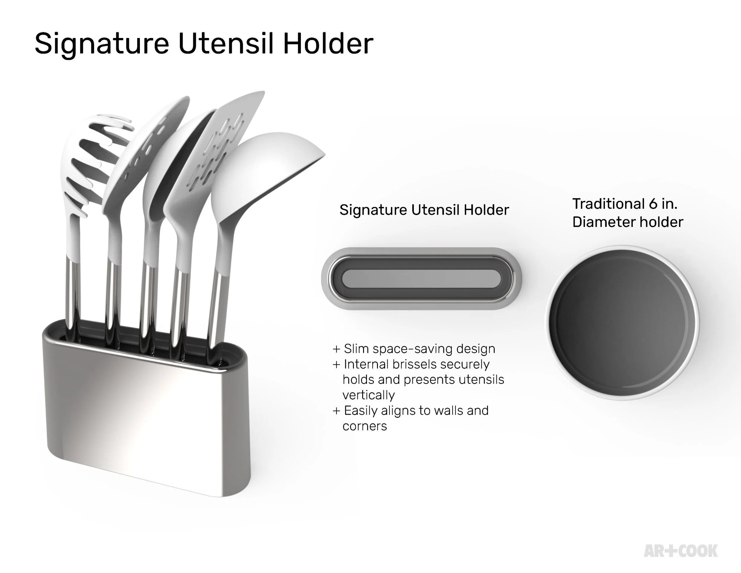
A slim, space-saving holder with internal bristles that grip and present each utensil vertically — built to align flush against a wall or corner, unlike a traditional round crock.
Cooking
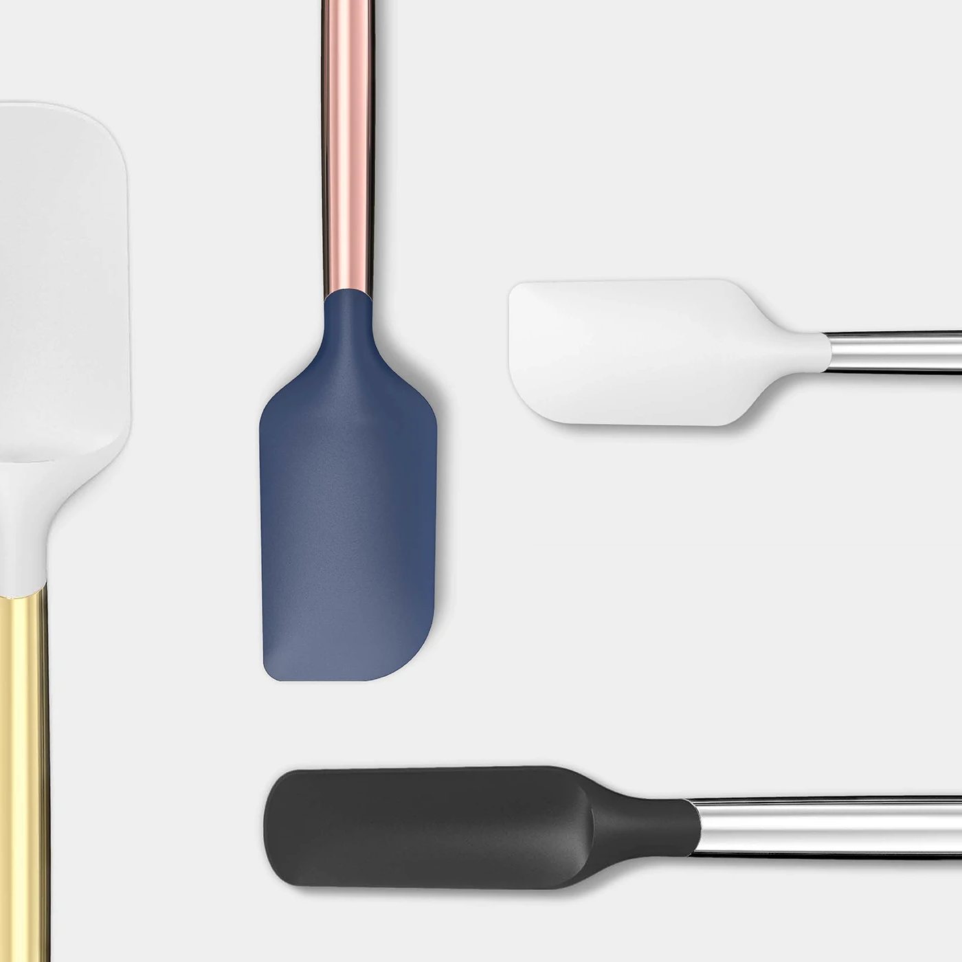
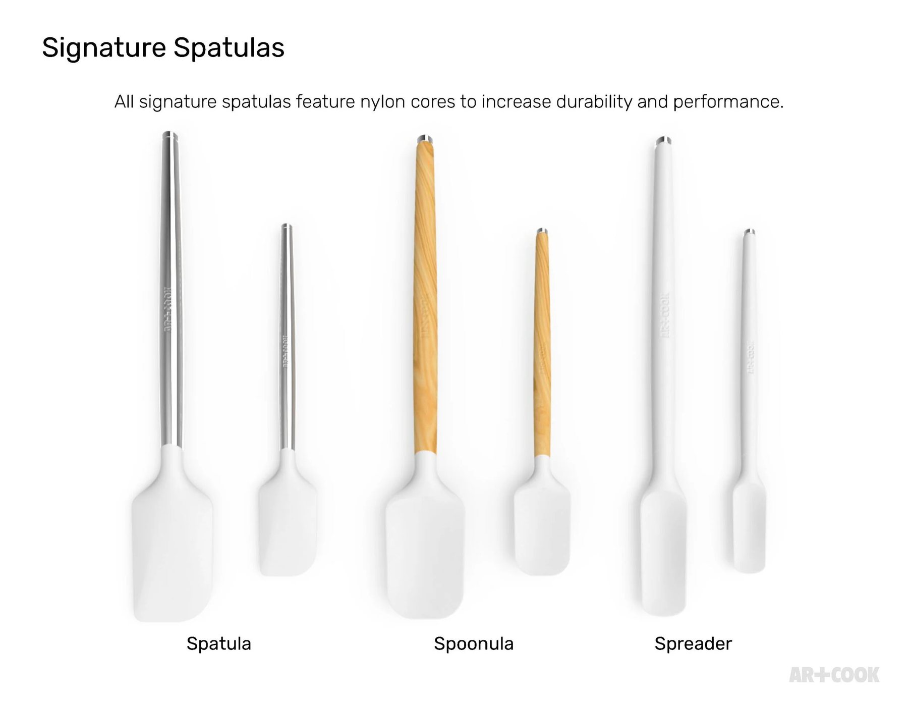
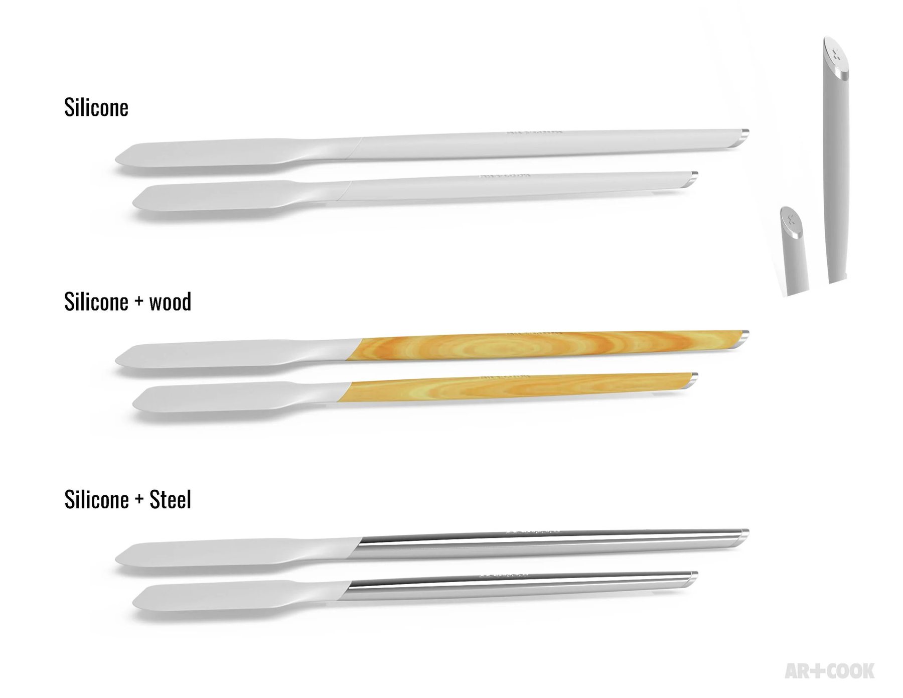
Spatula, spoonula, and spreader, each in two sizes — nylon cores built into every head for durability and performance.
Cooking
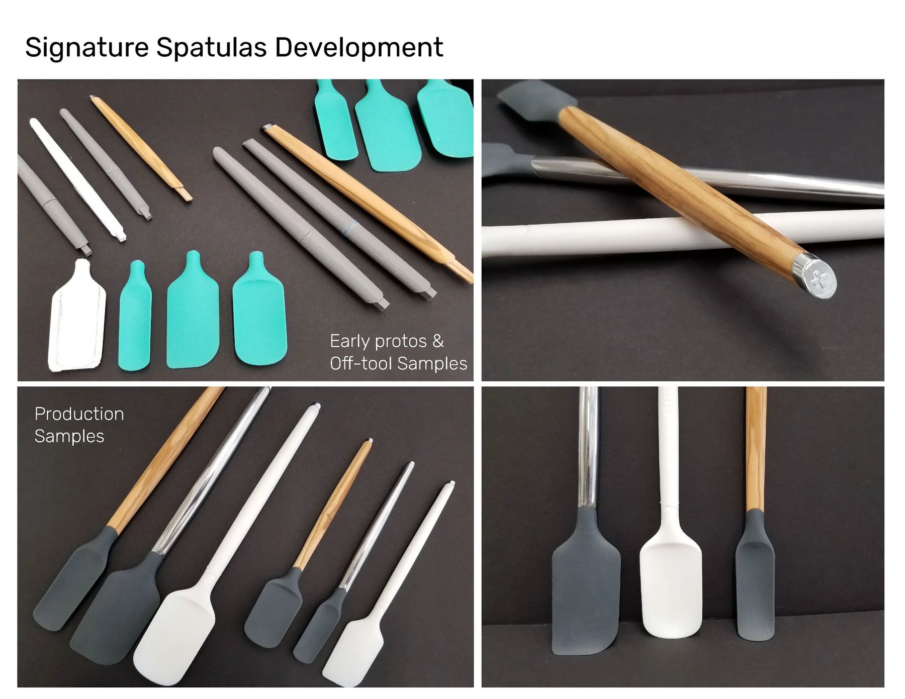
From early protos and off-tool samples through to production — silicone heads paired against steel, white, and wood-grain handle options.
Cooking
Three handle constructions carried across the same head geometry — silicone, silicone plus wood, and silicone plus steel.
Cooking
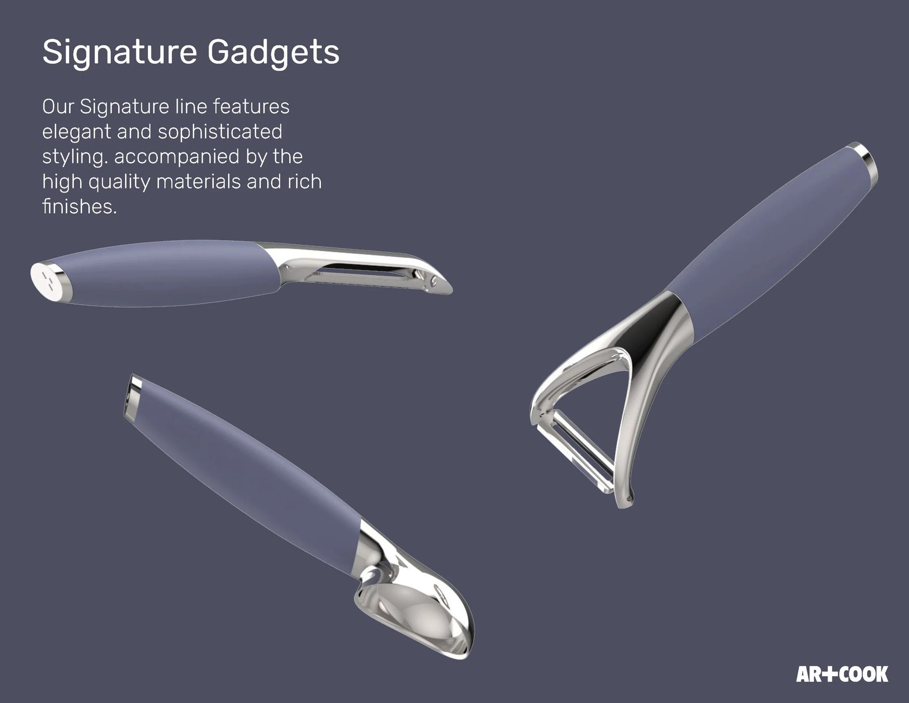
Elegant, sophisticated styling and rich finishes — the Signature line's design language carried down to the smallest tool.
Cooking
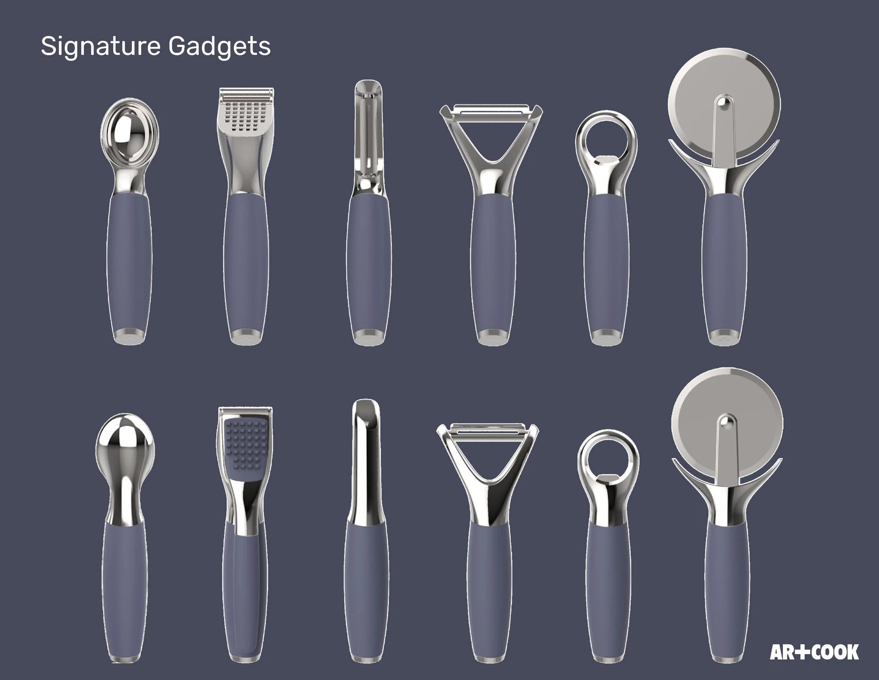
Melon baller, garlic press, corer, Y-peeler, bottle opener, and pizza cutter — six tools built on one shared handle system.
Cooking
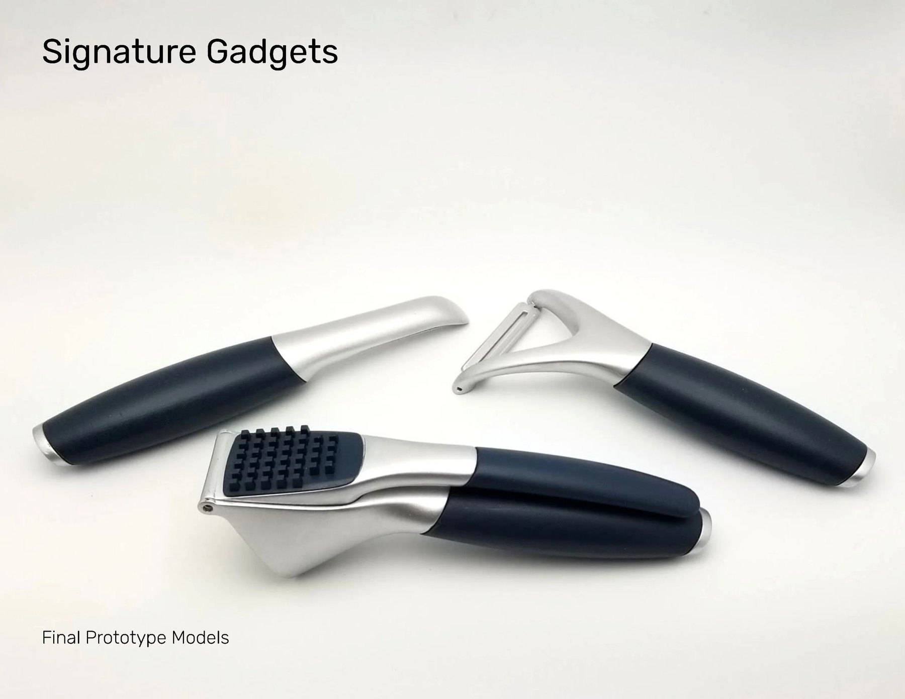
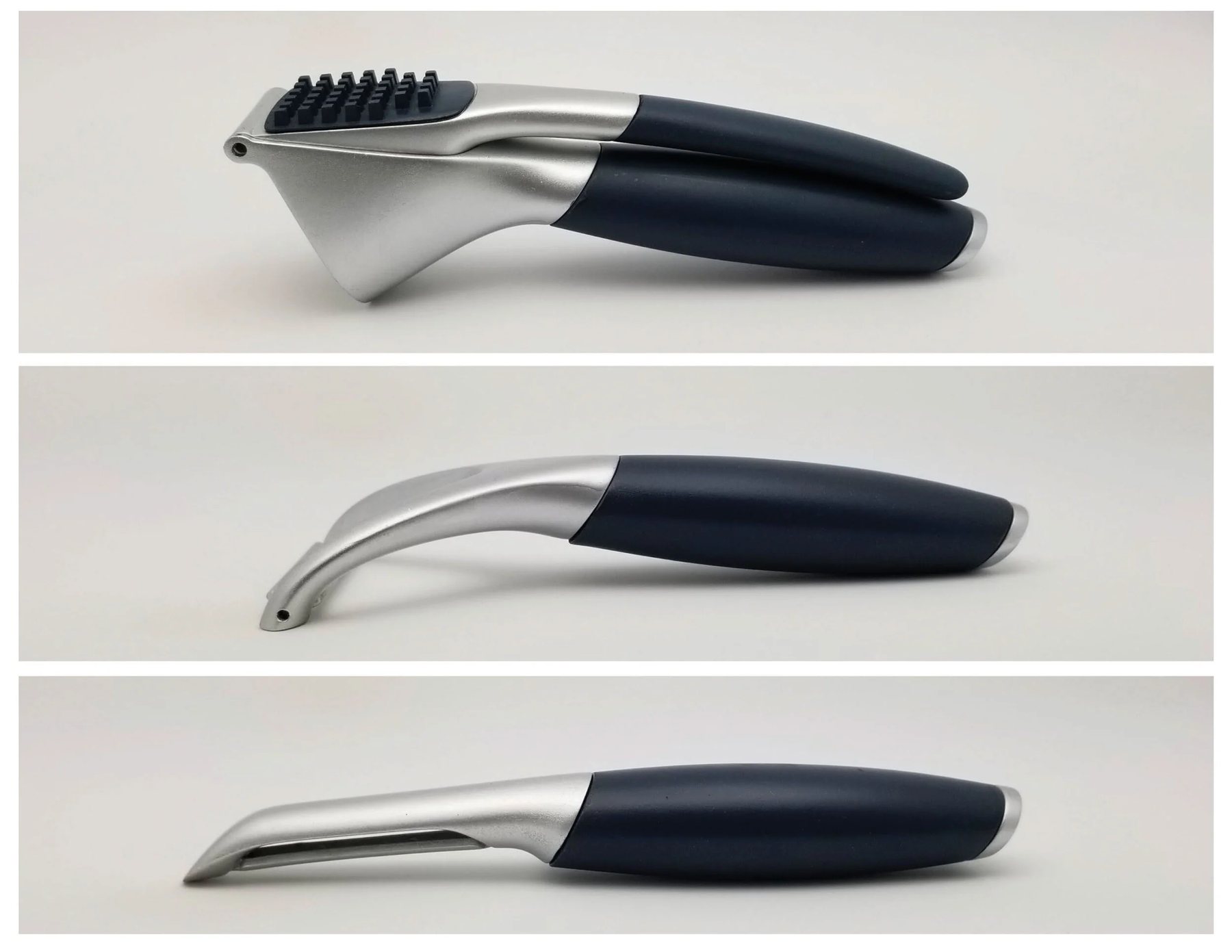
Final prototype models — garlic press and two peeler variants validated in hand before tooling.
Cooking
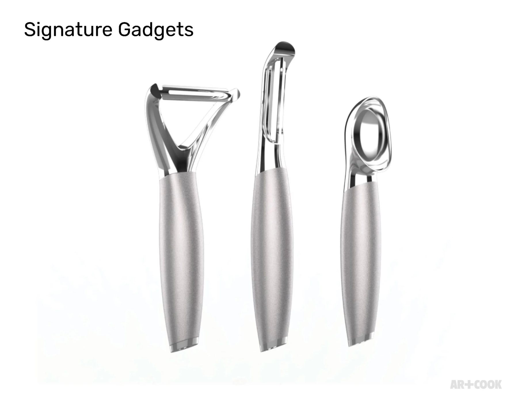
Y-peeler, straight peeler, and melon baller — each head resolved on its own before joining the shared handle family.
Cooking
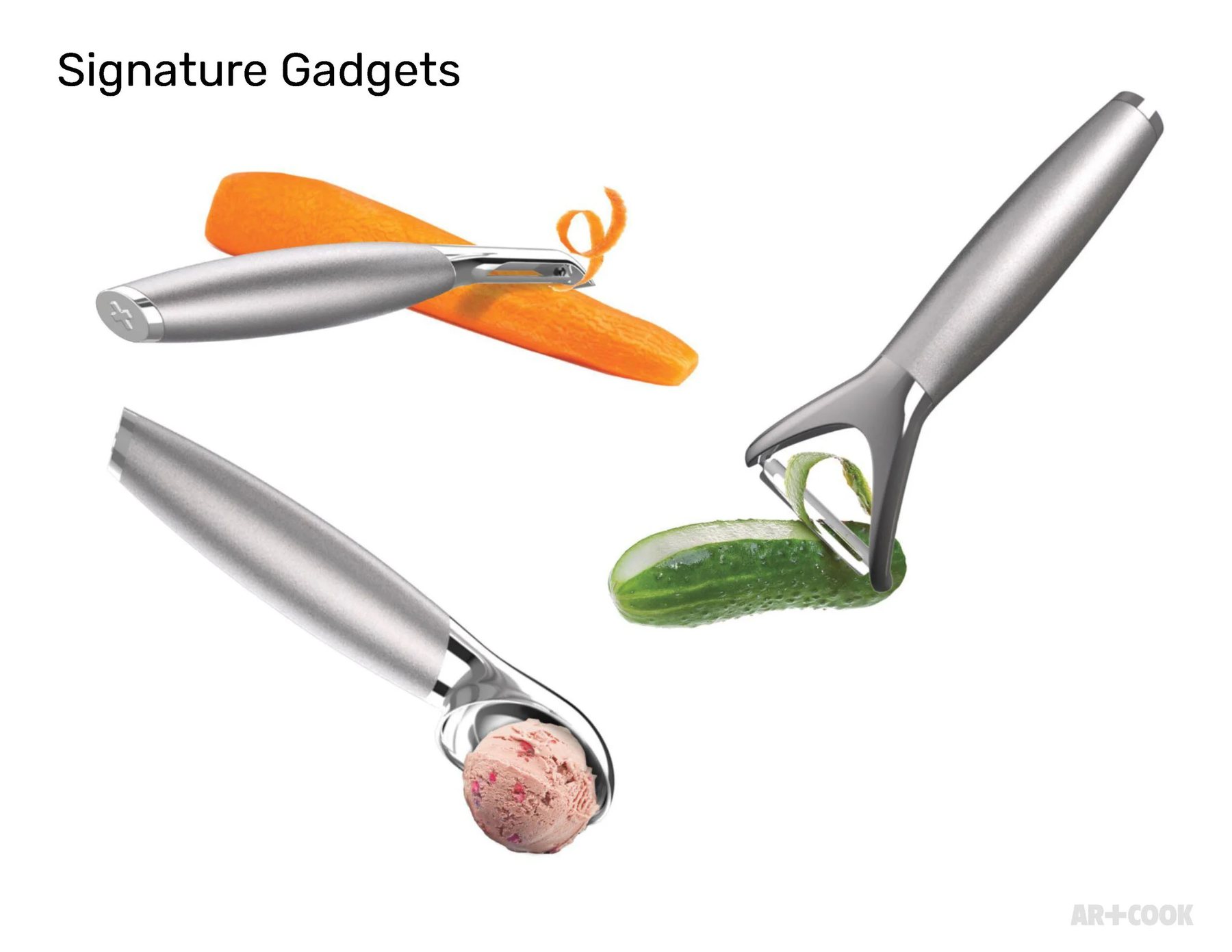
Carrot, cucumber, ice cream — the gadgets in use, proving the handle geometry holds up across pull, push, and twist motions.
Cooking
Development photography compared handle finish and head geometry side by side before the line was locked.
Cooking
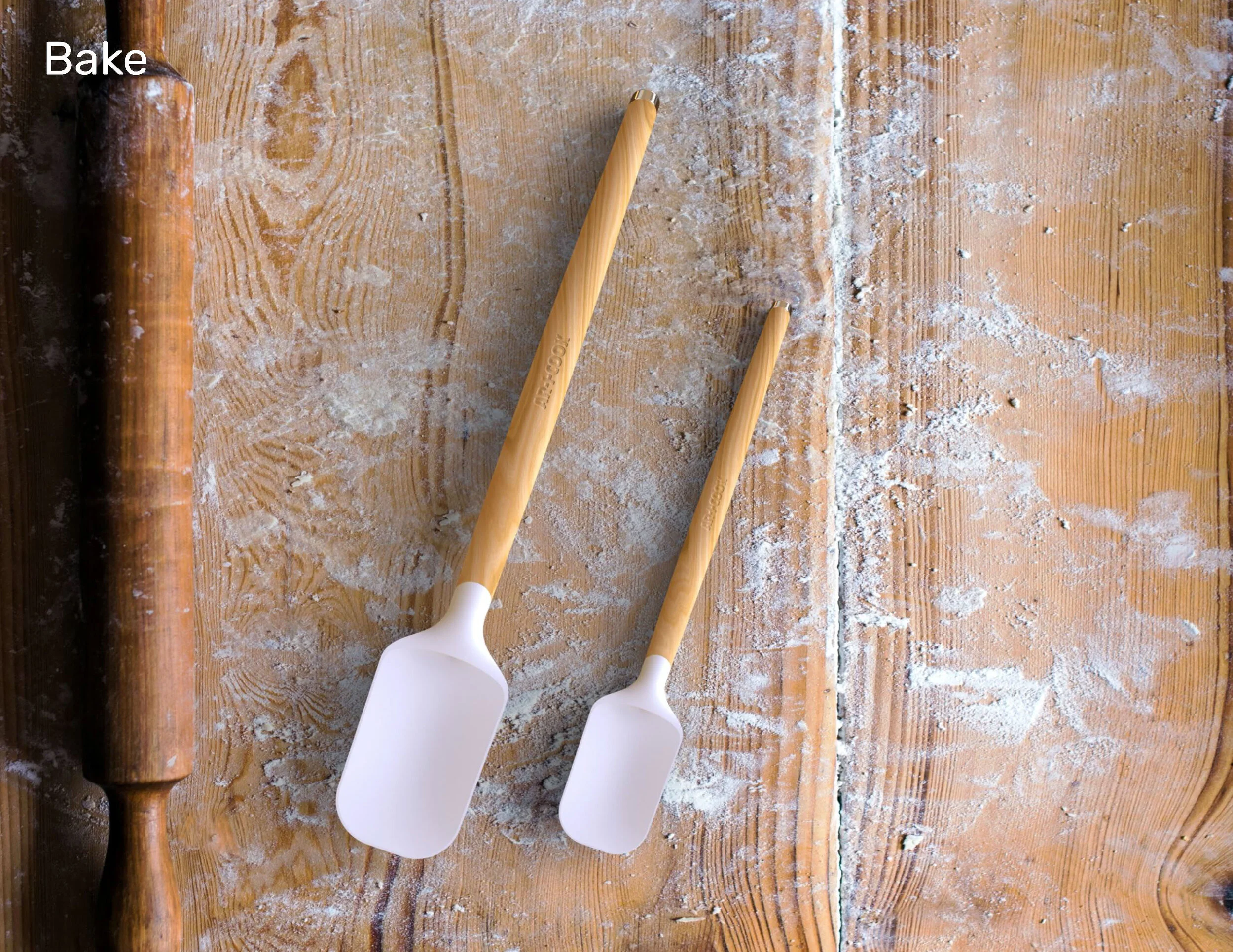
A rolling pin and two spatula sizes round out the collection — the same wood-and-white material language extended into baking.
Outcomes
Product Range
Design Language
Details