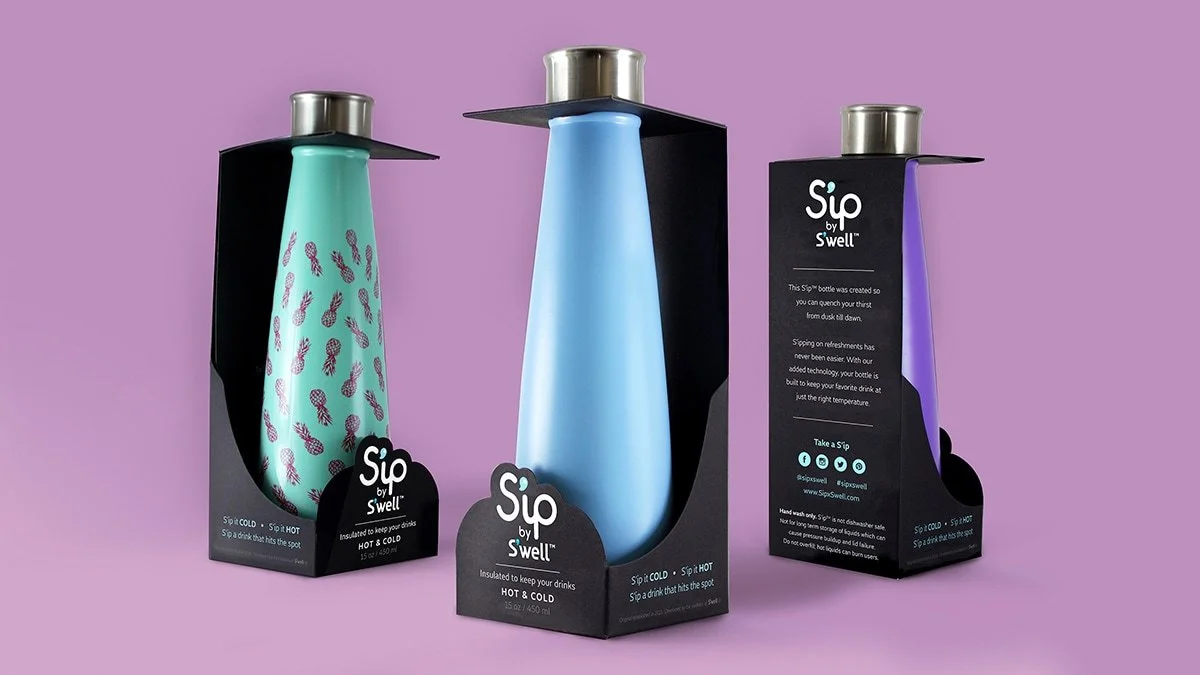
An accessible hydration line that brought premium bottle design to a mass-market price point — translating a refined silhouette into a simplified, bright, high-volume production architecture.
The opportunity was a mass-market line that could reach high retail volume without diluting the equity of the established premium range. The brief for Swell Sip was to bring that design language to a wider audience — maintain the performance and brand identity that had built the original's following while simplifying geometry and manufacturing for large-scale production at an accessible price point.
The design challenge was a translation problem, not a reduction problem. Swell Sip couldn't just be a cheaper bottle — it needed its own distinct silhouette, its own finish logic, and its own color-and-print system optimized for a mass-market retail environment and customer. Every detail — from thread pitch to paint tolerance — had to be tuned through DFM to achieve scalable production without compromising the tactile and visual integrity that made the original worth referencing.
Disciplines
Study
The risk with a sub-brand entry is cannibalization: if the new line reads as a lesser version of the premium range, it undermines both products. The design brief required a new silhouette — not a scaled-down copy — that carried the visual DNA through proportion and finish language rather than shared geometry. Swell Sip needed to read as adjacent to the premium line without reading as its discount version.
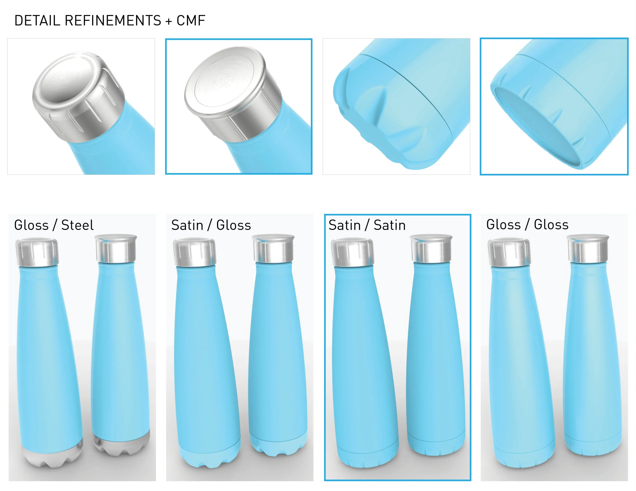
CMF analysis across competing hydration brands at that price point revealed a predictable landscape: opaque solids, minimal detail, low-tactility finishes. The opportunity for Swell Sip was to bring the finish-level attention of the premium market — Gloss/Steel cap pairings, Satin/Gloss, fluted grip geometry — to a price tier where customers didn't expect it. The CMF exploration evaluated body and cap pairings against fingerprint pickup, scratch visibility, and print legibility under retail lighting.
Strategy
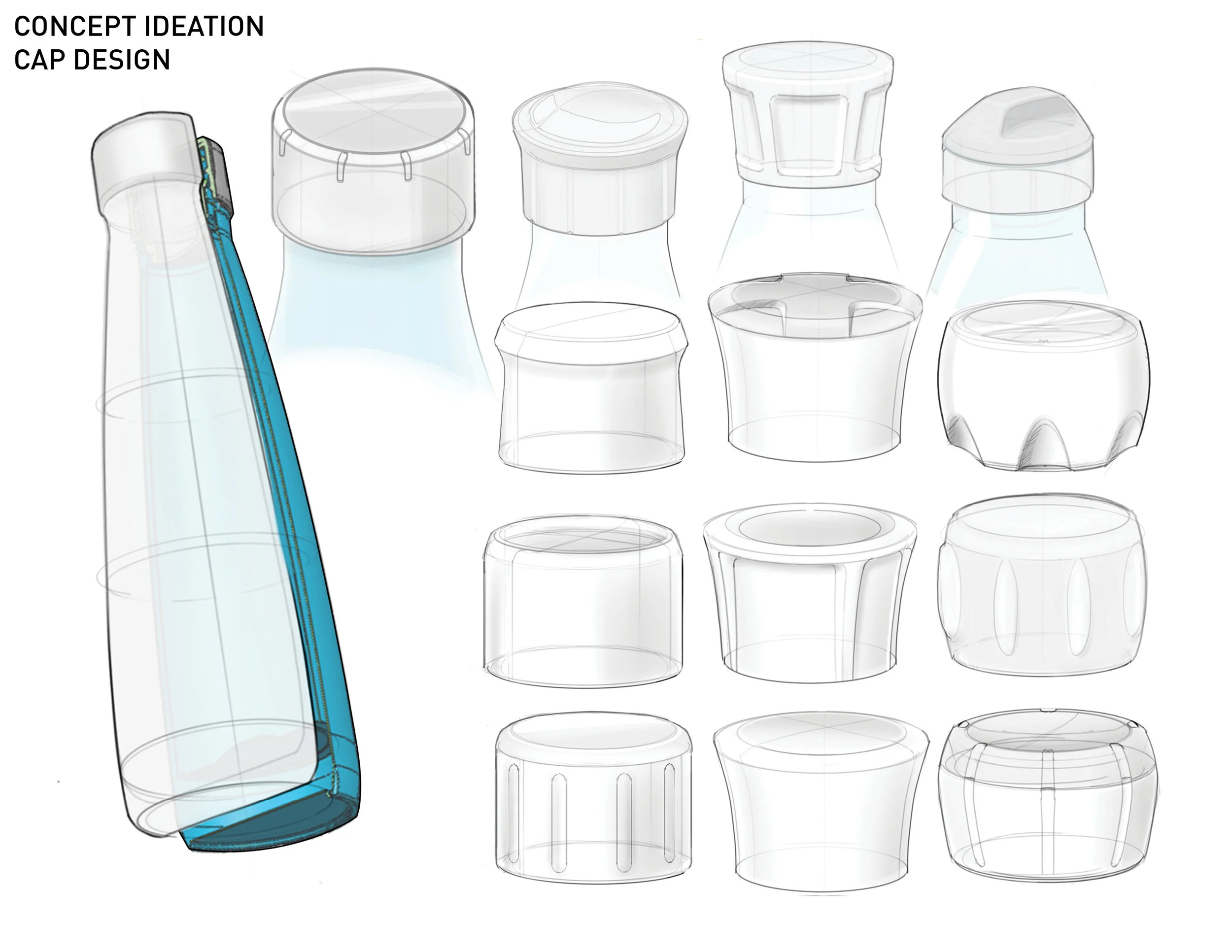
The cap was the most critical component — the element that most directly communicates brand quality at point of first touch. Cap studies explored form language and ergonomics across a range of options: flat vs. domed tops, tapered vs. barrel profiles, faceted and fluted grips, soft-shouldered variants that echo the bottle's friendly silhouette. The final threading and gasket system were simplified for reliable sealing at high production volume while maintaining the solid, premium feel the line required.
The bottle body proportion was designed around mass-market retail adjacencies: standard cup holder compatibility, shelf height constraints, and a silhouette that could carry whimsical prints at smaller scales without losing legibility. The base was reinforced with an optimized rolled edge and tuned wall thickness — engineering details that don't show up in photos but define the product's durability and perceived quality at the shelf.
CMF + silhouette exploration
Cap form development
Closure + thread system
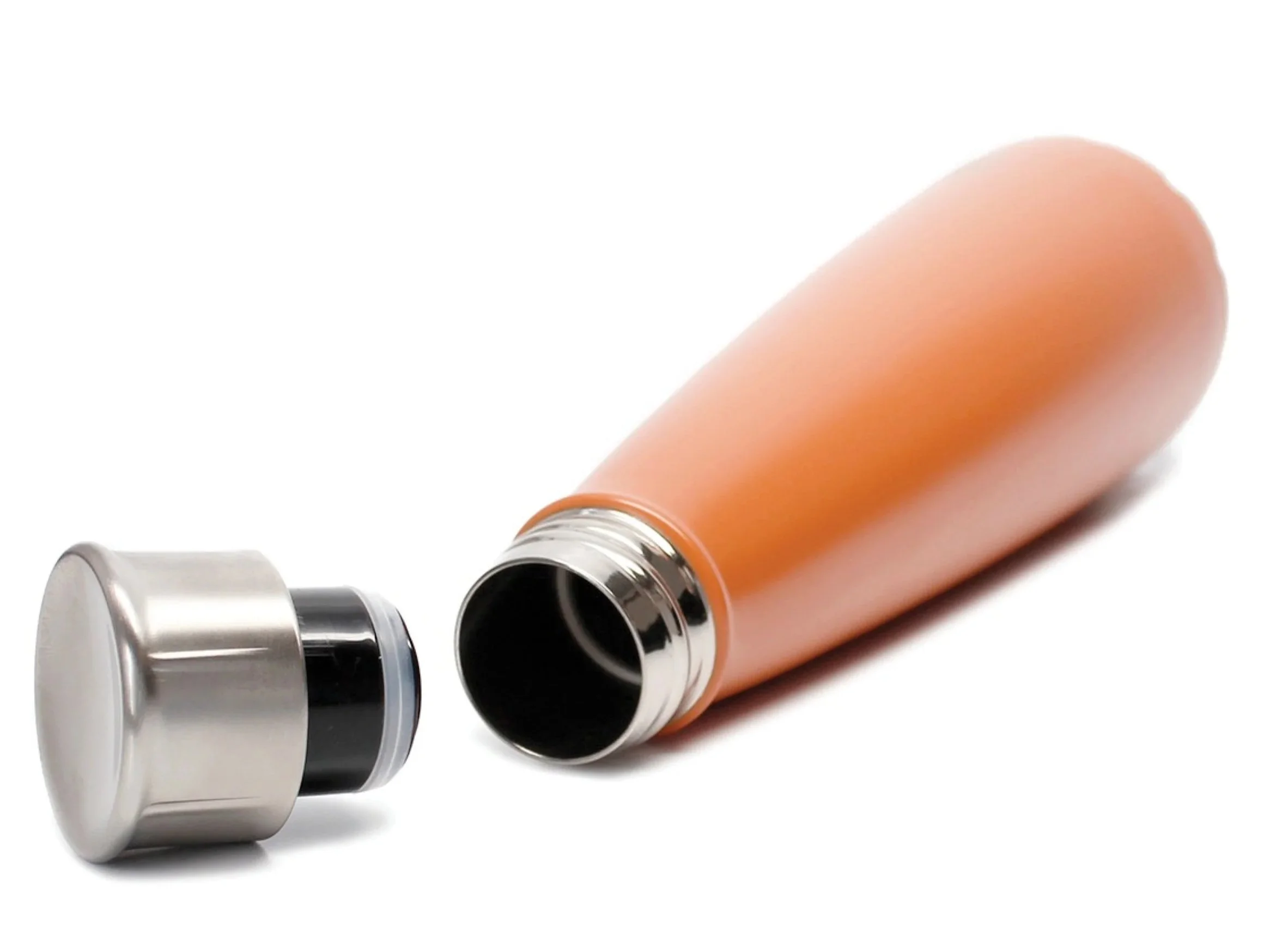
Finish pairings — Gloss / Satin / Steel
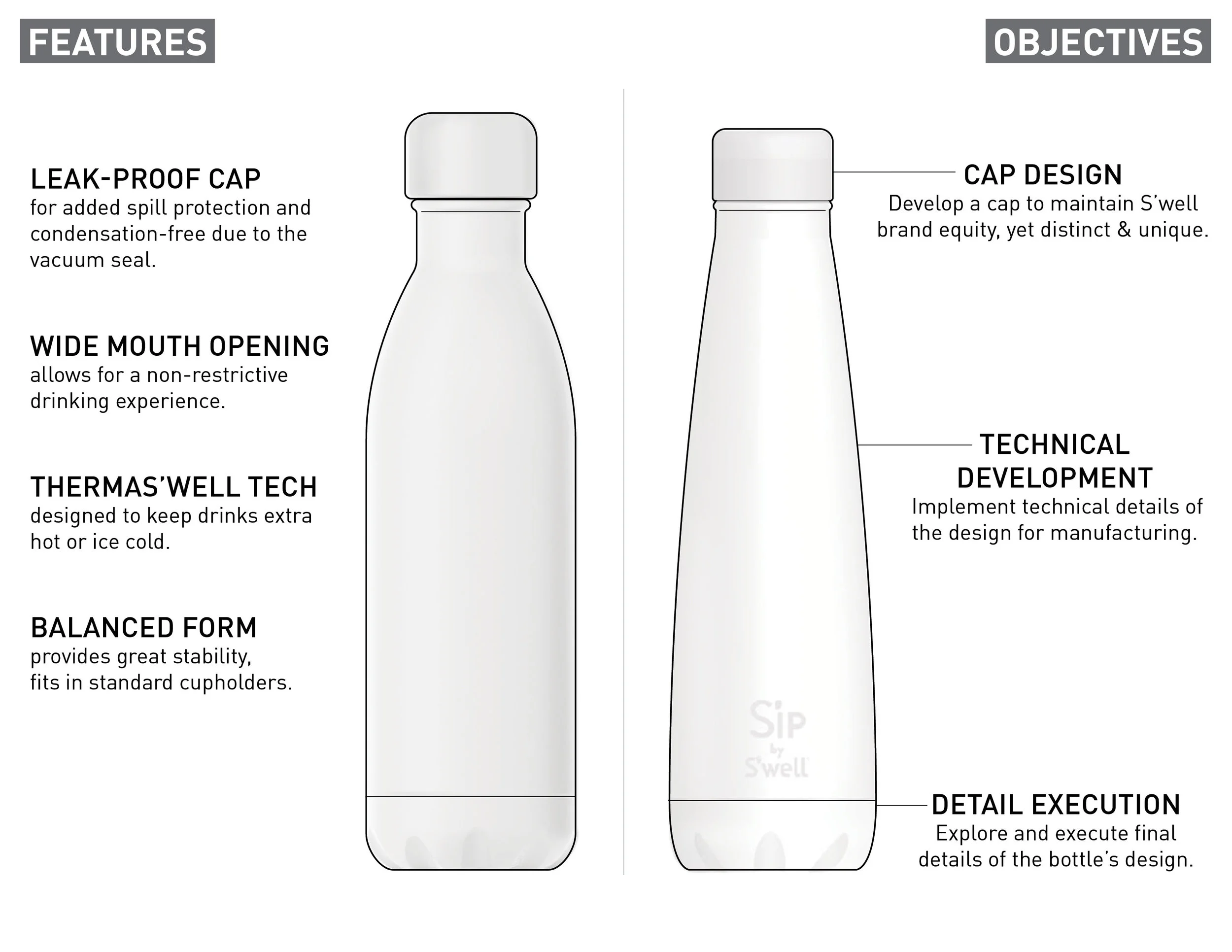
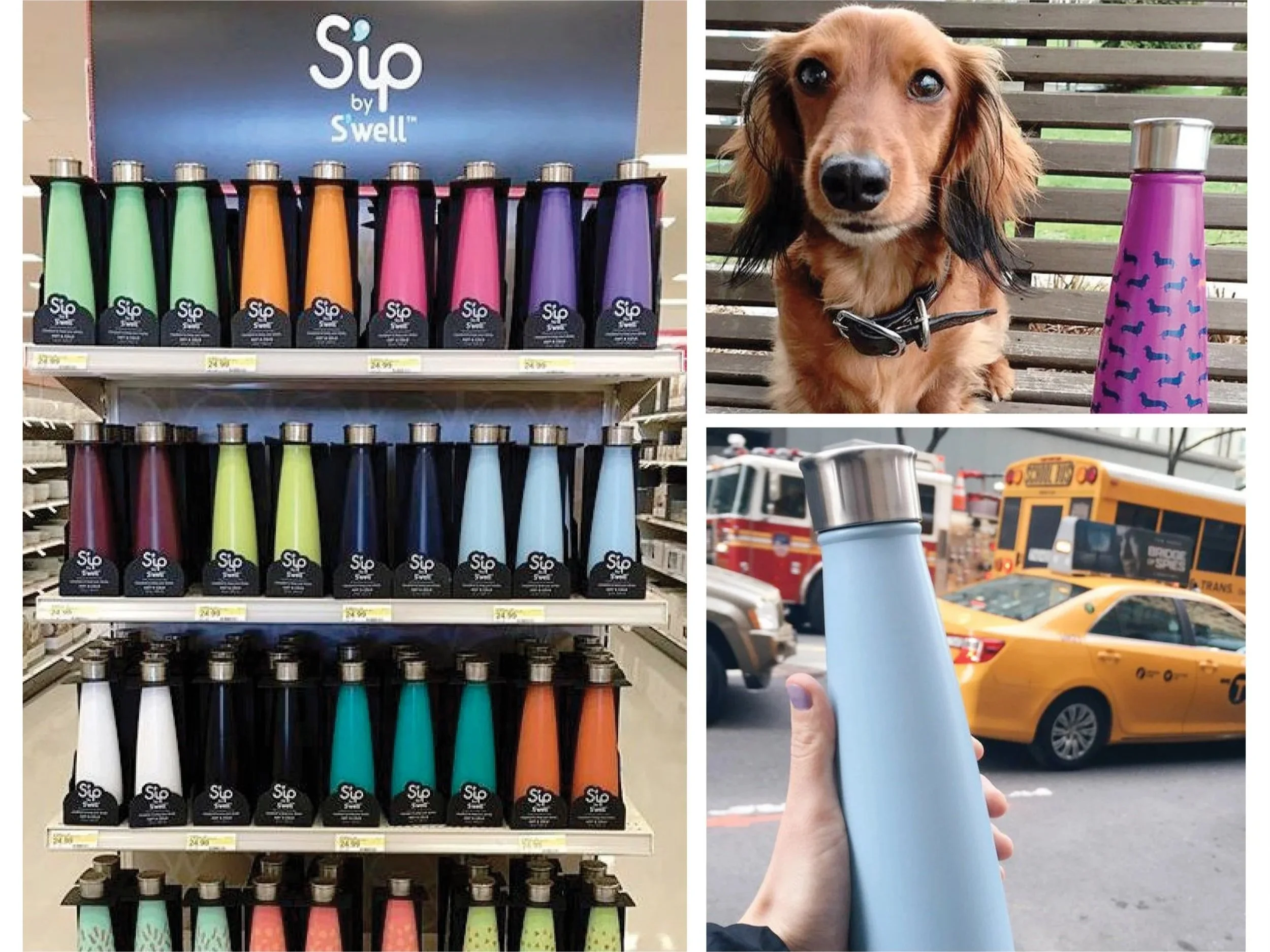
Color + print system
Final product — retail ready
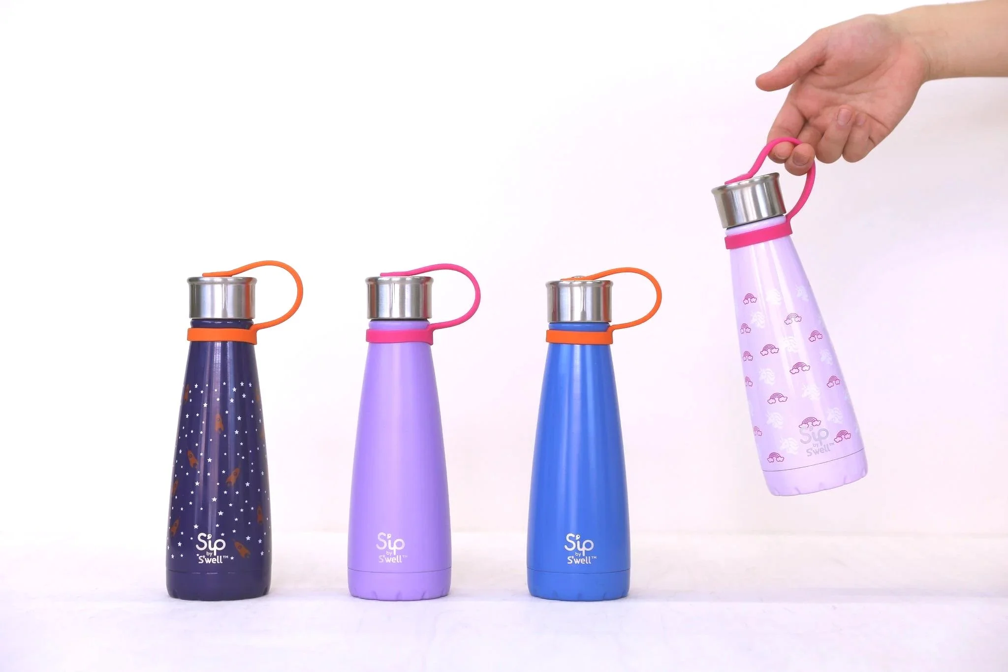
Lifestyle — in-use context
Result
Swell Sip launched as a second bottle line — distinct enough from the original to stand on its own, connected enough to carry its equity into a mass-market retail environment. A new silhouette with its own character. Cap engineering that maintains premium feel at accessible production costs. A CMF system calibrated for bright, whimsical retail presence without sacrificing the tactile integrity that defines the original range.
Outcomes
Engineering
CMF System
Details